You know how some people are obsessed with stamp collections or fantasy football teams? Well, we're obsessed with cookbooks. Here, we'll talk them.
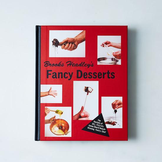
Today: Tamara Shopsin and Jason Fulford designed and photographed the Piglet-winning Brooks Headley's Fancy Desserts and Eat Me by Kenny Shopsin (Tamara's dad). We asked them about working on both cookbooks, that now-infamous crack spoon photo, and their design influences.
How much creative license did you have with Fancy Desserts? Where did you draw inspiration for the book?
The first time we meet Brooks, we all realized that we liked each other and had a similar sense of humor and appreciation for each others’ ideas. We probably wouldn’t have taken the project on if that feeling hadn't been there. So as far as creative license goes, we had free rein, but obviously we all wanted to feel good about the results. We (Jason and Tamara) would brainstorm together, and then present the ideas to Brooks. He would either say “awesome,” or he would suggest an idea that was better.
We all brought in a lot of references, including things like RE/Search magazine, a book about the band LiLiPUT, and Punk Press. We talked about it together, and the aesthetic of the book just evolved from there.
The book, for us, always had two main elements: high-end food and punk. For the high-end part, we left a lot of white space in the layouts and used a classic font (Caslon). For the punk theme, we limited the color scheme to black, white, and red. Originally we wanted to make the whole book black and white, but the publisher didn’t go for that. So we decided to shoot everything on either white or red and have the color come from the food.
Did Brooks ask for anything ridiculous? Was there anything that the book's publisher said "not gonna happen" to? Who had the idea for the crack spoon photo? For the "graffiti" on images?
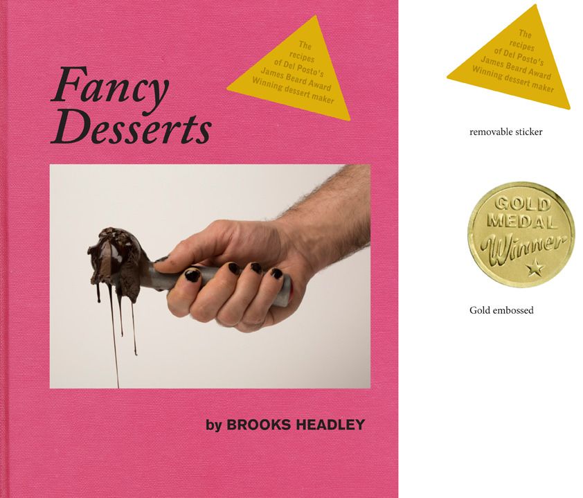
Brooks never asked for anything specific, but we knew he wanted the book to be fun. We proposed the crack spoon and graffiti. He never said “no” to anything, but we could tell if he wasn’t into an idea, even though he usually tried not to show it.
There was one idea where we borrowed dentures from Kenny (Shopsin). That one was too gross to make the final cut.
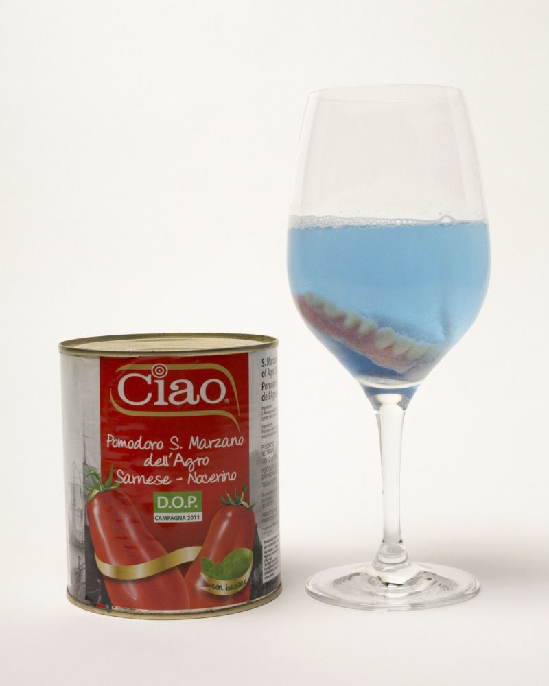 Kenny Shopsin's dentures: art, albeit unpublished.
The publisher approved the whole interior of the book and was really supportive, but when we got to the cover design, there were some battles—and we lost all of them. We really wanted to use the chocolate gelato picture on the cover, but the publisher would not budge. We tried more designs with the photo inset on a cloth-bound cover, but we just couldn’t get any of them approved.
The rejected cover.
Were drugs involved in the making of Fancy Desserts?
Yes, caffeine and sugar. We ate everything we shot.
What's your favorite part of a cookbook to design? How is designing cookbooks different and similar to designing other books?
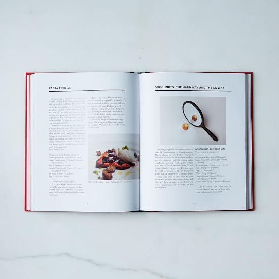
The main difference is cookbooks have a lot of artwork and all of them are custom made. It’s like designing a book cover for each recipe, so it is just like other book design except it has like 75 covers. With Eat Me, there were over 100 images. We spent an entire year making the pictures in Fancy Desserts (mostly to get in-season fruit—we weren’t locked in the Del Posto basement).
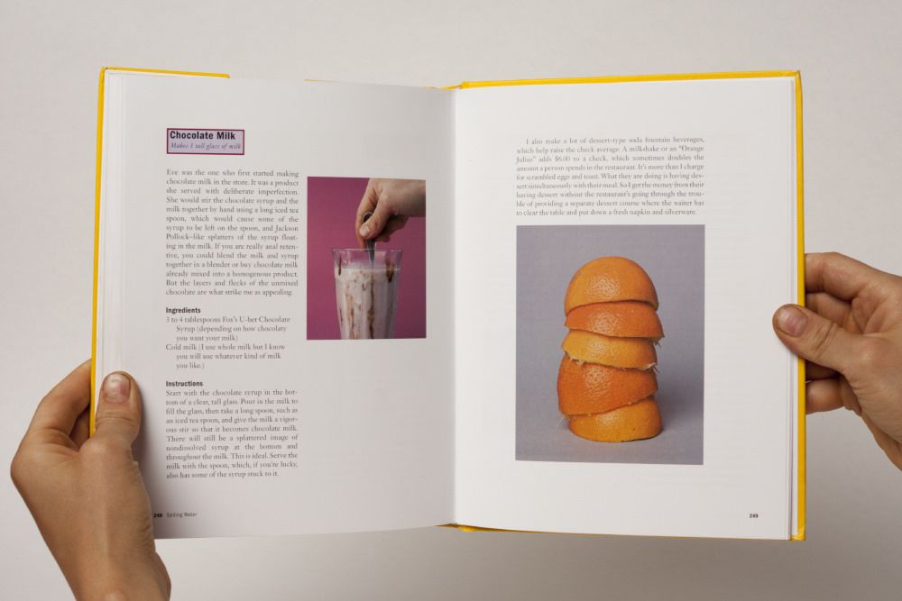
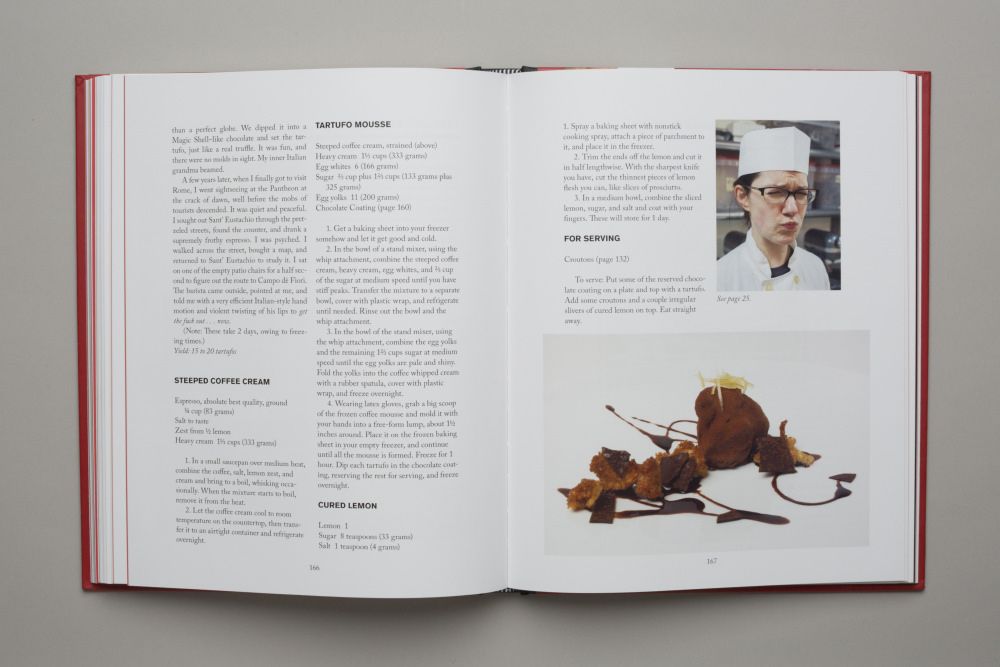
Spreads from Eat Me and Fancy Desserts.
Fancy Desserts reminds me of Eat Me in many ways: two-column design, same or similar typeface (right?), historical images, essays all throughout, general outlandishness. Was this intentional, or merely the result of you bringing your aesthetic to both books?
Brooks came to us because he loved Eat Me, so the book was a point of reference for us. Our intention for the design of both books was to reflect the personality and sensibility of the authors. And maybe the reason Eat Me resonated with Brooks was more than just aesthetic. When we design a book, it’s important for the ideas to remain in the foreground, so we don’t like to over-labor the production. We don’t want design to get in the way. And that resonates with Brooks’s food ideology.
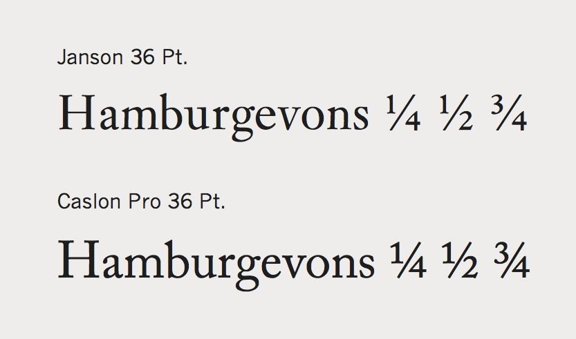
The typeface is not the same, but it is really similar—even the names are similar: Janson (Eat Me) and Caslon Pro (Fancy Desserts). Janson has better looking fractions. When the fonts are magnified, you can see the difference in the fractions. Caslon Pro is less old-world. Setting Eat Me in Janson was funny because Sophocles is set in Janson. Now Kenny Shopsin is too.
What cookbooks have designs and photography that you really adore?
White Trash Cooking! Phaidon has great ones too, like the first Rose Bakery book. I Know How To Cook has amazing illustrations by Blexbolex. We also love the good old fashioned Joy of Cooking, with its ribbon bookmark and informative drawings.
Tamara, you're a line cook at your dad's restaurant, but you also designed your dad's book. Which is a better gig?
Nothing beats cooking with my dad and brother.
First two images by James Ransom; all others courtesy of Jason Fulford and Tamara Shopsin.
See what other Food52 readers are saying.