We’ve been told not to judge a book by its cover, but what about its photography, layout, typefaces, paper—and how they all interact with each other? Each week, we’ll be sharing a book spread that’s worth taking a close look at for one reason or another. And we’ll ask you: What do you think about it?
Today: How to design a publication so its red pages aren't distracting.
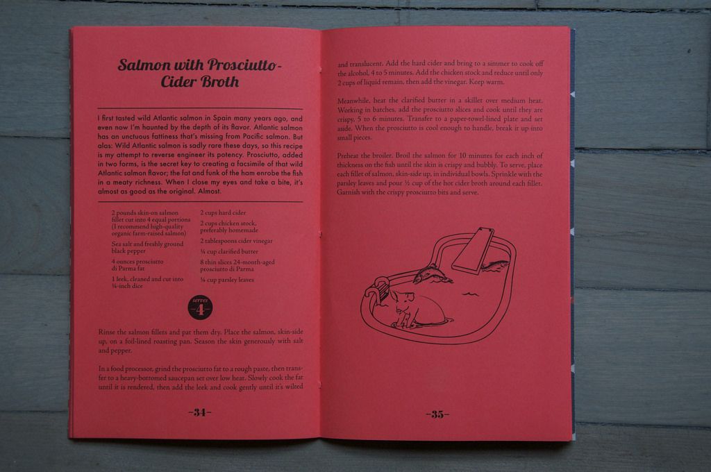
Prosciutto di Parma by Sara Jenkins
Short Stack Editions, Volume 14 (2015)
Design and illustration by Rotem Raffe
It's rare to find a book, magazine, or anything in between (like a Short Stack) with bright red paper as pages. On such a saturated color, will you be able to read the type? Will it look harsh or distract from the recipe? The Prosciutto edition of Short Stack solves these conundrums with smart design. Here are the four design choices in the above spread that make the fourteenth volume of Short Stack pleasing to the eye, approachable, but still audacious:
- The thin-lined illustration leaves enough negative space for the visual to read on such a saturated background. Any more detailed and the emphasis could move away from the lil' pig and fishes. And what a shame that would be.
- Whereas the illustration melts into the red a bit, the strong typeface of the recipe title, page numbers, and serving size contrasts with the red and becomes a focal point of the spread. Your eyes need somewhere to land, and mine go first to the recipe title, then the serving size, then the image—what about you?
- The heft of the headnote typeface adds importance to the element on the page. Without reading it or knowing anything about the author's intent, I feel as though the headnote is important—it should be read regardless of whether I make the recipe or not. I feel like there is a great story waiting for me in that headnote.
- On the other hand, the two-column design of the ingredient list makes the recipe seem friendly—not consuming of time to source or execute, nor a focus on the page.
What about this spread sucks you in? How 'bout those red pages?
On Black & Highly Flavored, co-hosts Derek Kirk and Tamara Celeste shine a light on the need-to-know movers and shakers of our food & beverage industry.
Listen NowWritten by: Ali Slagle
Popular on Food52
3 Comments
I like the inclusion of line drawings - wish more cookbooks had them instead of photos! ;o)
See what other Food52 readers are saying.