The New Food52

by:
October 11, 2011

Cornucopia

Wondering why things look different? We gave Food52 a little facelift!

After two years of our wonky but lovable site, we thought we (you and us, but especially you) all deserved a more well-furnished home, a place that better reflects who we are now: a busy hive of a food community. We hope you’ll be as happy with our new site as we are – so go forth and explore!

Now, it’s easier to find just the right recipe, get inspired, see more of the activity of other members all over the site, and follow great cooks, all in a spiffy new wrapping.

We love the great experiment that Food52 has been so far. This is another big experiment -- nothing is final, and we'll be working continuously to fine-tune the new bits and bobs. We hope you love it as much as we do. And we’d love to hear what you think.

Here are some of the things we're most excited about:

Along with all the site changes, we’re also expanding our Shop! Starting this week, we’ll debut our new Food52 Shop with special offers that we hand pick and curate for you. We’ve put together an exciting lineup of exclusive packages we think you’ll love – seasonal ingredients, tools, farm excursions, and tabletop must-haves – can’t wait for you to see!

Shop the Story

We hope you'll bear with us as we settle into our new digs (there are bound to be a few hiccups along the way), but of course please let us know about any major bugs you find on our special site questions arena of the new Food52 Hotline.

Welcome to our new hive!

Amanda & Merrill

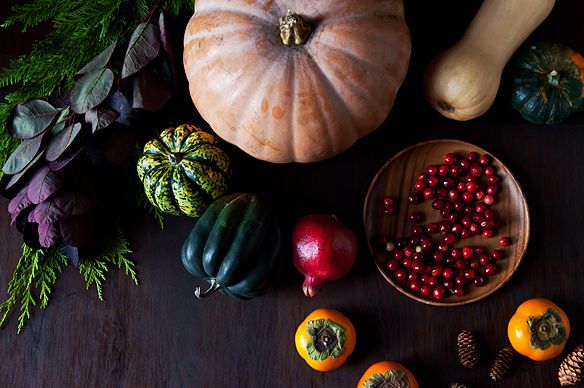
Photo by James Ransom


See what other Food52 readers are saying.

  • eternalgradstudent
    eternalgradstudent
  • drbabs
    drbabs
  • Winn Jewett
    Winn Jewett
  • erspo2000
    erspo2000
  • Weezythecat
    Weezythecat
Food52 (we cook 52 weeks a year, get it?) is a food and home brand, here to help you eat thoughtfully and live joyfully.

201 Comments

eternalgradstudent February 2, 2012
Love the new look! Much cleaner, but still beautiful and stylish. :)
 
drbabs February 2, 2012
NEW LOOK TODAY!! Looks great!!
 
mrslarkin February 2, 2012
Yup, i noticed too! looks really good.
 
boulangere February 2, 2012
It does. It makes better use of space, and is much more comfortable to read while scrolling down.
 
Winn J. January 13, 2012
I love the new design, but those ads are way too aggressive. It's hard to navigate the website without unintentionally hovering over the landmines on the site for more than 3 seconds, which triggers a full-page video advertisement. It was so distracting that I even wrote up a more verbose commentary. http://sandstonemedia.com/blog/2012/aggressive-online-advertising-where-line
 
Amanda H. January 13, 2012
Thanks for letting us know. We've reported this to our ad network.
 
erspo2000 January 12, 2012
I am wondering how I can see a list of all the contests. You have the choices available to view lists of all of your other sections (menus, community picks, etc) but there is nothing that has "View All Contests." Please help me find that! Thanks!
 
Amanda H. January 13, 2012
We don't have that available right now but we'll add it back soon.
 
Weezythecat January 1, 2012
How to print recipes with the pictures??
 
Amanda H. January 1, 2012
We don't include photos with the recipe printing format because photos use up a lot of ink and this annoys many people (because printer ink is so expensive). Hope this makes sense!
 
LobsterBrieAvocadoBreath December 31, 2011
arg and why do my posts happen in guadruplicate? sorry! I would remove the extra, but there seems to be no way.
 
LobsterBrieAvocadoBreath December 31, 2011
While visually appealing, for some reason, the utility of the site has diminished for me. Wholesale change is very confusing. A piece at a time might have fared better. Food52 has been such a joy---absolutely reignited my interested in cooking, baking, and broadening my interest in trying new recipes, mainly because it was clean, simple and entertainingly original. Why not foodpickle? why hotline (zzzzzz). I will figure it out, because I know Amanda and Merrill are at the heart of the matter, but why all things on line need to be fixed when they aren't broken is a mystery to me.
 
oldkitcheninflatbush December 28, 2011
Okay. I am just giving up for now. I'll be back and see if it works.
 
oldkitcheninflatbush December 28, 2011
I often have a hard time just getting to the recipes link. It takes way to long to load, if it loads at all. I am here now looking for inspiration for a dinner party I'm having on Friday and can not get to any good searches. I hit the recipes link and nothing came up. I then tried cream of mushroom soup it loaded quickly...but that is not what I wanted to do. I want to just peruse recipes for appetizers, side dishes or whatever and it is not working. This is not the first time this has happened. I hope that you can fix the glitches. I really loved the old site. I don't think the recipe search is easier.
 
Amanda H. December 28, 2011
We are indeed having issues with recipe search -- we tried a new system that would bring a greater variety of recipes to the surface (rather than just those with most buzz, which is the way the old system worked). We don't like the new system either! Plus it's buggy and slow. We're actually working to fix this issue right now. Should have something released by the end of next week. Thanks for your thoughts -- always good to get feedback -- and apologies for the issues.
 
Will December 14, 2011
I don't like change, especially change with complexity. The new site is very discouraging to me.
 
WileyP December 8, 2011
Okay, so slowly but surely I am getting familiarized with how this new site operates. It's still really "busy", nearly too much for this old mind to cope with, but at least I've figured out how to see the new recipes. Now on to the color of text in those nice e-mails about "Someone has commented on a thread you contributed to". As I see it on my monitor, the background is black and the text is dark gray. Surely that can't be the way it was designed, can it? I have to move in to less than a foot from the screen to differentiate the text from the background enough to make sense of the posting! Methinks a little more contrast would be appreciated by many of us with eyes whose odometers are on their second or third trip around. Also, there is (as we speak) an advertisement for Charter set of Canal House Cooking: Volumes 1, 2 &3 that is blocking part of this text entry box.
 
susan G. December 8, 2011
WileyP, I have the same age premium, and the same hard-to-read issues. My solution is to hightligh the answers so that they turn into blue background with white text -- lots of contrast, easy to read (I just read yours). I'm sure this isn't at the top of the editors of FOOD52 "Fix" list, but they'll get there while we hold on with makeshift fixes. Thank goodness the hard core users like us are hanging in -- because the content is still so wonderful!
 
WileyP December 8, 2011
Wow! Why didn't I think of that?! Well, they say that two things happen as you age: First, you start forgetting things that used to be so simple to remember (like that highlighting text changes the color). Second...second...aw crap, I can't remember what that was. Anyway, It works just great, Susan G. Thanks!
 
PAFriedman December 8, 2011
The design is nice and clean but the flippin photos make us dizzy! No animation or changing images. Just use a different one each day.
 
Amanda H. December 8, 2011
Thanks for your thoughts -- can you give me more detail on the photo issue? Do you mean on the home page up top?
 
erspo2000 December 6, 2011
I am wondering how I can see a list of all the contests. You have the choices available to view lists of all of your other sections (menus, community picks, etc) but there is nothing that has "View All Contests." Please help me find that! Thanks!
 
mcatherinep November 27, 2011
Adding my thoughts about the new website....I agree with the other comments about the page being too busy, and about my personal lack of interest in whether someone else is looking at a recipe or saving it. (Perhaps you could make that information optional?) I also miss the editors' picks --are the community picks intended to replace the editors' picks? I'm thrown off when a recipe shows up as a Community Pick but has zero views. My favorite items are the contests (especially the winners), and the ability to search for a recipe that might come recommended by others. And I dearly loved the editors' comments in the Editor Picks. I've had no problem with speed in loading, at all, at any time. Please keep up the good work.
 
Amanda H. November 27, 2011
Thanks for your comments -- we are working on a re-thinking of the home page now. Stay tuned. To answer your question about editors' picks -- yes, they are now called community picks, because while we still select the recipes, many people from the community test the recipes. The issue of the views is simply a bug that we haven't had a chance to fix yet. All of the community picks have views, they're just displaying as 0. In the meantime, perhaps more telling is the number of times the recipe has been saved.
 
Austro-Kat November 21, 2011
It has been extremely slow for me for a few weeks, and doesn't show nicely on my iPad, but I' m not too discourage yet ( but did want to say that it is not just a Thanksgiving- related issue for me!)
 
deanna1001 November 21, 2011
The speed has been steadily decreasing in my experience. Yesterday it took a full 90 seconds for the page to load. This morning was better, but still took about 30 seconds. Being impatient, I usually give up after about ten...(I have a fast cable connection and fast computer.) It's a bit discouraging and I find I spend much less time here than I used to. Hope it improves...
 
deanna1001 November 21, 2011
And yesterday I tried to look at the hotline and it wouldn't load at all! I know you're working on all of this...launching new websites can take a while...I still love the site when I can get it to load.
 
DAVILCHICK November 20, 2011
Still sooooooo slowwwwwwwwwwwww....is it me or you?
 
Amanda H. November 20, 2011
If you're talking about today, yes, it's slow because we're having a ton of traffic. But have you seen improvements on other days? You should have because we've made some changes. If not, please let me know!
 
aargersi November 16, 2011
WOOT! I just uplaoded a photo and I didn't have to do one single thing to it first - progress! I know you guys are working your rear ends off, and it shows - better speed, easy uploads, etc. Keep at it - you are doing great stuff!
 
Amanda H. November 16, 2011
That's great to hear -- And thank you!
 
Mrs. B. November 16, 2011
I love Food52 and have gotten so many great recipes from this site that I make over and over. So far, I have found the new website hard to use - mainly just the home page. I love seeing what contests are going on and have a difficult time finding them on the home page. There is so much information on the home page that I get overwhelmed. I am sure overtime you will work out this out!!! Thanks for creating a great community of cooks and recipes.
 
Amanda H. November 16, 2011
Mrs. B, thanks for your thoughts and generous note. We appreciate your trust. We agree with you (and others) about the home page and are going to make changes to it in 2 phases. First, we're going to reduce the amount of content. And second, we're going to completely re-do the page. This will take time so hopefully in the meantime, the reduced content will help. Thanks again!
 
Abra B. November 14, 2011
Sadly, I find that I seldom come to Food 52 anymore because of the "new look." For me it's very busy, and things are hard to locate. Also, I used to visit here in part to escape the FaceBook style "constant contact" effect, and now the site is full of the "who likes what, who saved what" kind of information that I find really irrelevant to the mission of Food52 as I understand it. When everything and everyone is flashed across the screen, nothing really stands out, and putting so much emphasis on the people really detracts from the emphasis on the food, in my humble opinion.
 
Amanda H. November 10, 2011
WedgeMom, your comment does not fit with the spirit of generosity that defines our site. I'm sure you can find another site that pleases you more, and we wish you the best.
 
WedgeMom November 5, 2011
Okay - Can longer hold it in - This new site stinks - actually it - same meaning four letters more vulgar. I could care less who is downloading what - Just looking for good content. Yuck Yuck Yuck
 
lyncha00 November 5, 2011
There is too much going on on the homepage to absorb, visually. I do love the richer and bigger pictures. There needs to be 1 click access to my saved recipes from the homepage, the "recipes" button on the top left goes to the ones I've submitted, I'd rather it go to the ones I've saved.
 
Blissful B. November 4, 2011
Oooooh! Website pages are loading fast today. I know that took a lot of work behind the scenes. Thank you!
 
aimeebama November 3, 2011
Woah. Some nice ideas, but I'd love to see the contests up a bit higher on homepage (that's why I visit), and (like so many people) I'm finding everything way too big on the screen. Good luck with the changes. . .
 
Janet H. November 2, 2011
New format is so fractured I might need a script for strattera to get through it. A prime example of contributing factors of short attention span problems. Seems frenetic, too much on the page. I'm 55 and very active but this is not what I'm looking for on a foodie site.
 
lazychef November 1, 2011
One minor thing I find bothersome about the new home page is that the featured contest is buried halfway down the page. I know the contests are not the end-all be-all important feature of the site, but I quite like seeing what's going on at the moment without having to comb through the whole page! I thought the old placement in the upper right corner, with tabs for open contest/finalist/winner, was nicer. Just a thought!
 
Aimless October 31, 2011
I'm trying to get comfortable with the new format but it's not working too well so far. It has lost the neighborhoody look and feel that I liked. It's much too big for my browser window. I tried shrinking the display but my middle aged eyes complained. I've loved the site a lot and have gotten some outstanding recipes here. Not feeling at home yet though. One thing hasn't changed: slow and hanging up when I click on links.
 
masapas October 30, 2011
I love food52 but I cannot get the full page to fit my browser unless I reduce it to 75% :-(
 
Amanda H. October 30, 2011
Are you on a Mac or a Pc?
 
LFL October 29, 2011
This has been my favorite site. Your new look is so complicated, so confusing, so very commercial that I no longer want to visit. There is no point of view. It is now just a hodgepodge of stuff. It seems to me you've lost your focus.

I dearly hope you simplify
 
kaytye October 26, 2011
I've been a lurker here for a while and the only thing I object to, is the sense of entitlement that a couple of the more seasoned contributors seem to have. There's been a lot of whining and complaining about the site. This site is a community based one and bigger than just one person. I love the new look and feel. The wrinkles will be ironed out in due time. Thanks!
 
lloreen October 26, 2011
I use food52 all the time and refer friends to it. I am sure that you will work out some of the design issues over time. Like others, I am really confused by the overwhelming visual information on the home page.
You must be aware of this issue by now, so I have a comment specific to the community-building aspect. I have enjoyed getting to know other cooks and following their recipes, but that doesn't mean I want to know every time someone saves a recipe. Why do I care that Cook123 saved a recipe? I don't know this person, and even if I did, it doesn't give me very useful information. It is just distracting and taking up space on the page. Perhaps you can find a way to edit this rolling scroll of activity down to more interesting posts. I wouldn't mind an update off to the side everytime someone posted a new recipe. I just don't want to know every click of every user (let alone the daily activities of facebook friends!)
Good luck with the redesign - these things all seem to get worked out in the end.
 
chromatikos October 26, 2011
I know you've been working hard on this, but I have to add my voice to those who find the new layout cluttered and chaotic. When it comes up on my screen, I don't know where to look or where to go.I don't visit one-tenth as much as I used to before the redesign.
 
betty888 October 26, 2011
Just cruising through the new site and taking it all in. Some of my thoughts are already reflected in the comments by other users but one thing I don't think has been mentioned is the "live" bar at the bottom of the page. Is there a way to close that or have it expand only when you mouse over it? It is just adding another visual element to the page and covering content. I work on a small laptop so will take all the screen space I can get! Thx!
 
crazyblues October 24, 2011
I think there are a lot of bugs in firefox. I keep getting an error page - that happened when I was trying to log in tnoght. love the look, but not the workability! I'm sure these details will work themselves out...
 
Ms. T. October 24, 2011
Congrats on a beautiful and fresh new design and some cool new features/functionality! Overall I think it looks gorgeous and I love the way it really shines the spotlight on the cooks and the recipes. Still on my wish list (in order of priority--the top 2 are most important by a long shot. The rest are small potatoes):
1. The ability to sort my saved recipes into categories and to search within my saved recipes
2. A mobile-optimized site
3. Links from a cook's profile page to their Winner's Q&A and Cook Spotlight
4. When it lists "community picks" under a cook's name, I wish I could click on that link to see which recipes were community picks

I'm also experiencing some of the bugs that others have mentioned, such as not getting emails when my Food Hotline question was answered (even though I didn't check the box.) Also, in the "Cooks" section right now, I'm featured twice under "Winner's Q&A" (but it says "Christine" above my photo??? Not sure why!), and once in the "Cook Spotlight"--right next to eachother. Even though I can be a ham sometimes, this is a little too much limelight even for me--and I'm assuming it's not intentional.

I know y'all are working out the kinks--much appreciated!
 
Ms. T. October 24, 2011
Oh, I forgot one thing: does it mean anything when you are "following" a cook? It doesn't seem like it. It would be nice to get some notification when a cook you are following adds a recipe, or is selected as a finalist, etc.
 
Blissful B. October 23, 2011
You are working so hard on this site & we all appreciate it! I know the email notifications are your priority this week, but you also mentioned openness to evolving the home page design. My understanding is that you want to feature more content (which is great) but many viewers (including me) find the homepage overwhelming. I have a couple of recommendations: (1) The photos are too large. You have amazing photographers on this website, and I understand your desire to feature them, but the majority of home page photos are better left "bite size" with the larger photos featured when people click to that article or recipe. That would be much easier on the eyes. The exception is your slideshow box on the top left, which is eye-catching in the larger size (and would be more eye-catching if it was the only large photo display on the home page). Please consider thumbnails for the subsections. (2) I think you need more color to define the headings of those subsections. Right now they're a dim top-lined black & white, making them hard to find/read/notice. Martha Stewart's website is a great example of easy to see subsections (shadowboxed in blue). (3) Have some of your columns/modules be text lists instead of photos. People love text lists. They're easy to scan & easy to click. These changes would allow you to show more content in a way that's easier to see and navigate. That's my opinion anyway & don't I always have one?!
 
skittle October 23, 2011
I can't answer any questions in hotline....not since launch. What felt like a warm community now feels like I am being shut out. :(
 
Amanda H. October 23, 2011
skittle -- thanks for letting us know. Do you mean that you enter an answer and then it doesn't show up? A few people have experienced this -- they answer a question and it appears not to show up. But if you refresh the page, it should show up. I know this is not the answer you want to hear -- it should NOT work this way, but we are working on it. Would you mind going back to a question you've answered and seeing if your answer has shown up? Please let me know if it has or hasn't -- this would be helpful info for us as we try to track down the bug. Thanks!
 
skittle October 24, 2011
It will not even allow me to answer at all. I see on this screen, there is an add" button. When I try to answer anything on the hotline, there is no add button on my screen. It's puzzling. Even now as I type, the answer box has appeared over your response to me....and I cannot even see what I'm typing...please forgive any typos!
 
skittle October 24, 2011
Ah! It actually allowed me to answer a question today. Don't know what changed, but something did. :)
 
Amanda H. October 24, 2011
I'm actually having the sam problem. Are you still having the response box appearing over the previous respons? I've upgraded this problem to urgent on our list. Thank you.
 
DAVILCHICK October 23, 2011
Hi, it's me again. I know I've been nagging/complaining for a couple of weeks now but I'm really panicked about the speed (actually lack of speed) that we can go from window to window. I wanted to pull up the candied tomato appetizer recipe and my husband bailed and went to epicurious. Also, when I put in the search for candied tomatoes - nothing came up. We shouldn't have to know the entire name of the recipe in order to search for it, right? I hate to rain on your parade but I prefer the old way of searching with the winner and runner up icon. And I also can't filter the search by comments. The number of views don't interest me as much as the comments do. I'm really sad to be going into the holidays with this new format. Sorry, I don't mean to be negative but the trick to great websites: keep it simple, keep it fast.
 
Amanda H. October 23, 2011
Hi Davilchick -- thanks for your note. Not sure if you saw the message I posted here a few days ago, but we've been working intensely on the speed issues, and it's going to take some time. We currently have a temporary fix, which should make most page loads pretty zippy, but today we had a big traffic surge and that may have slowed things down for you. Our site will be just as fast as it used to be; it's just going to take us a little time to optimize all the pages.

I just searched for "candied tomato" and this is the results page I got -- is this what you're looking for? http://www.food52.com/recipes/search?c=1&recipe_search=candied%20tomato We've never had a feature where you could filter by comments, but we did have a filter called "most buzz" -- try the filter "popular"; it's like "most buzz" but a little more refined.

Lastly, we don't want you to worry about the holidays -- that's why we released our changes now, so we'd have a few weeks to get our house in order before the holidays start. Thanks for your detailed note and hang in there, we're on the case!
 
Amanda H. October 23, 2011
Hello everyone! Just letting you know we're finally sending out our "Welcome to the New FOOD52" email today. If you receive it, we didn't want you to feel confused. You've already seen the site but many others on our list probably have not. We held off sending this email until we had some technical issues shored up, and the re-worked home page up. Also, wanted to let you know that we published a post that explains the thinking behind our redesign and the direction that FOOD52 is heading -- hope you'll have a chance to read it! http://www.food52.com/blog/2632_constructive_community Thanks again for your patience -- see you around the 'hood!
 
LloJo October 23, 2011
Where are the videos? Can anyone tell me? Do they have a home? Have any new ones been made? I can't find them ... thanks
 
Amanda H. October 23, 2011
You should be able to find the videos through the main navigation button called "Articles" -- http://www.food52.com/blog. We haven't posted any new ones recently, but we have about 5 of them ready to go! Also, on this Articles section, we'll be adding a sub-nav that should make it easier to find just videos. May take us another week or two to get this implemented. Glad to know you look for the videos, and thanks for bringing this to our attention.
 
LloJo October 23, 2011
Thanks Amanda - thought I was going crazy!
 
Drew L. October 23, 2011
The redesign looks great! The pages feel richer and the added functionality in every nook and cranny is perfectly executed and very much appreciated. Keep it coming!
 
Amanda H. October 23, 2011
Thanks Drew!!
 
Sugar O. October 22, 2011
Hi ladies --- I know you're still working out the kinks with the site, so perhaps this is something you're already addressing. Others have commented that they aren't receiving email notifications, but I am having the opposite problem -- I'm receiving too many of this variety: "someone has commented on a thread you contributed to". Apparently I didn't check the "Please don't email me..." box when I commented on your post about the site makeover...and when I click the link in the email(s) that should allow me to opt out ("Unsubscribe from future email messages on this comment thread"), it doesn't do anything, and I keep getting multiple messages from the same thread. Hoping you can help! Thanks.
 
Amanda H. October 23, 2011
Well, this isn't good! Thank you for letting us know that opt-out isn't working. Sorry about that. The email notifications issue is a thorny one but we're going to try and tackle it this week. Hope you can do us a favor and tolerate the notifications on this thread for a little while longer, and we'll work hard to get the opt-out fixed. Thanks again for your note -- if you hadn't written us, we wouldn't have known!
 
LloJo October 22, 2011
Thanks for listening and making some changes - I think it's much better now you've added 'latest' categories and it's not as cluttered as before, and thanks for making the videos more obvious - like that a lot. It doesn't make my head spin as much as it did before! I still personally think there's too much going on but I understand the rationale - I think you want to highlight and spotlight more of the great content. The only problem with that is that there's too much of it on the home page, and I think maybe you underestimate our (users) ability to search, use the menus at the top, and dig deep to personalise our own experience. However, Will continue to play with it and feedback!
 
Lizthechef October 21, 2011
OK, it is starting to work for me, except for the fleeting new wildcard - where is he/she/it ?!
 
Amanda H. October 23, 2011
The wildcard is currently featured on our home page in the main photo box. But yes, we need to find a more permanent home for it. When we were working on the redesign/re-imagination, we'd stopped awarding wildcards, and we brought them back when were too far along in the process. So now we need to re-think where they should live.
 
Lizthechef October 23, 2011
I would stick the wildcards in the contest box - just a suggestion...
 
Lizthechef October 21, 2011
OK, it is starting to work for me, except for the fleeting new wildcard - where is he/she/it ?!
 
heather_wallace October 20, 2011
I'm warming to the new site although I agree with other commenters that there's a LOT going on and I find it harder to find content rather than easier. My biggest complaint is that I lose the ability to move to the next page when I am searching recipes. I know there are many more great recipes to browse but after a page or so the next page button at the bottom disappears! I find this even with the recipes I have saved. I can only see the first page of content even though I have more than 100 recipes saved. HELP!
 
Amanda H. October 23, 2011
Heather, thanks for your note. It's going to take us a few weeks to work out the kinks, but we're getting there! The home page was reorganized last week, and will continue to evolve. The pagination issue with recipe search was a technical issue, and it should be fixed now. Please let me know if it's still not working for you. Saved recipes needs some work -- and we are definitely on it. Can you let me know if you're still having pagination issues with it? If you are, can you please take a screenshot and email us at [email protected]?
 
LloJo October 20, 2011
I've read all the comments and tried to play with the site more before commenting publicly - but - I can't work it out at all and I surf a LOT and used to be in website design! Eeessh my eyes! It's a beautifully executed site but I simply don't know where to look for new content. It is way too cluttered. Like Bowmgbo I used to tell everyone I know about this site - but my mother would have an impossible time with this. I appreciate the motivation behind trying to bring more content to the fore, but I think in doing so, the *new* content gets totally lost. I don't know where to check for new stuff! I'm going to do like Antonia James and bookmark the recipes page, hope that new recipes are added on twitter, and pray that some of the clutter is removed - because I'm not sure I can work with it at all - and this site has truly inspired me to make and cook all sorts of things I've never done before. Finally - am I a complete idiot - I cannot find the videos, which I used to really enjoy!

Sorry to be negative - the graphics are gorgeous - but it's just waaaay to busy to be practical for time limited people.... :(
 
lazychef October 19, 2011
Does the new website work better with some browsers than others? I mainly use firefox and the page is always wider than the window it's in, so I have to use the horizontal scroll bar in addition to the vertical...this is quite annoying, since it happens on every part of the site. Anyone know how to fix this?
 
Amanda H. October 23, 2011
Here's a simple fix: if you're on a Mac, click the command and - (command and minus key) and it will reduce your screen to fit. You can also hit the green button on the upper left side of your browser. If you use IE, select View and then select a percentage to enlarge or reduce page size. Or just let us know what kind of computer and browser you use and I'll send you specific resizing directions.
 
AllisonGG October 19, 2011
Is there any way to adjust the site so that the print feature returns? I know where it is supposed to be (on the left) but 98% of the time the page doesn't load correctly and the top part is all out of order and/or overlapping, causing me to lose that function. I miss printing the recipes I want to cook! I have tried reducing the size of the page, and increasing...no change. I use IE7 on a pc. Thanks!
 
Amanda H. October 23, 2011
Are you still having trouble finding the print icon? It should be at the bottom of the tool bar on the left-hand side of recipes. It's grouped with the email and flag icons, as well. Are you still having overlapping text? Please let me know!
 
Bowmgbo October 19, 2011
For the past year or so I've told anyone who will listen that you are my favorite food site. I like your vibe and One Pot Kale and Quinoa Pilaf et al have changed our lives!

So I really hate to be negative, but I don't get the new design at all. My eyes don't know where to go on the home page, and when I do focus on something I am not sure what I am looking at. I hope you will be able to tweak the site back to health.

Sorry.
 
Amanda H. October 23, 2011
We see this as not just a redesign but a reimagination of the site and we hope you'll stick with us and see how it evolves. If you haven't had a chance, you might want to revisit the home page, which has changed quite a bit since last week. See what you think!
 
weekend A. October 19, 2011
I'm slowly getting used to the new design. I find the home page very cluttered and difficult to navigate, but have been working it out for myself on each visit.
I do have to say, though (and this is coming from someone with a not-very-filled-in pie) that the pie system seems a bit odd. It doesn't make the site seem very welcome to newcomers, and might even detract people from contributing. The word "cliquish" even comes to mind, but that might be overstating things a bit or might not be the right word. Just something about it is a bit off putting.
 
drbabs October 19, 2011
Oh, please don't say cliquish! We're really a warm, friendly, loving community and spend way too much time reading and commenting on each other's recipes and stories. All are welcome! Jump in and play with us--I promise you'll find a bunch of new friends who love to cook, talk about food, shop for food, grow food, play with food, write about food, read recipes, read about all aspects of food. (Hello, my name is Barbara and I'm a food52aholic..........)
 
MeghanVK October 18, 2011
I think an extra tab or two at the top would help get some content off the homepage and still keep it accessible - perhaps a "Features" tab that I could mouse over to get links to Jenny's in the Kitchen, Dinner and a Movie, etc. I like having the idea of keeping these weekly items top-of-mind and easy to get to, but I don't think that's happening with them living willy-nilly on the homepage.

From this user's perspective, the homepage is just too cluttered. I have to scroll all over the place to see things and the whole thing has a slightly cheesy scrapbook feel. I think some pruning (especially to get everything to fit on one browser window) would help it look (and be) much more sleek and intuitive.
 
AntoniaJames October 18, 2011
I'm with you on all of this. My workaround until the Home page becomes more user-friendly is to set my bookmark to the Newest Recipes page, and then to check the twitter page for FOOD52 once or twice a day, then click the links to new content. ;o)
 
Amanda H. October 23, 2011
Just letting you know we've added an "Articles" button to the main navigation (look on the far right) so you can see all of the latest articles. We've also reorganized the home page so that all of the latest articles appear on the left hand side. The middle column of the home page is now Latest Activity (although we still need to do some rearranging of modules here), and there is not a larger photo carousel at the top, leading you to the main articles/recipes of the day.
 
Margit V. October 18, 2011
Are you going to make available your previous entire list of COOKS? I really valued that aspect of the previous site: reading a brief bio, then all the recipes of that particular cook. Now, I cannot find that list.
 
Amanda H. October 23, 2011
Do you mean the cooks page we used to have? If not, please let me know. We replaced the "Cooks" page, which didn't change much (mostly because we didn't put much time into designing it) with a new Cooks section that will constantly update with new featured cooks. You can get here through the main navigation bar at the top of the page. Cooks is the second item from the right. We hope you'll like this new section!
 
EmilyC October 17, 2011
Quick question -- I'm not seeing the recent activity log on the homepage, nor did I see it much this weekend. Maybe it's coincidental, but I saw it when using Safari on an iPad. (I typically use Firefox on a PC.) Are you planning to bring it back? I miss it! Thank you.
 
AntoniaJames October 17, 2011
I'm not seeing any activity either . . . .just huge, colorful, distracting video ads. Yes, I realize that ad revenue is necessary. But I'd be quite happy to pay handsomely for a premium membership, on an annual basis, that doesn't include any ads, if I had the choice. ;o) P.S. I'm using Chrome on a PC.
 
WileyP October 18, 2011
I have the same problem as EmilyC and AntoniaJames - I used to love going through the pages of new and active recipes every day, but can no longer find such a section.
 
susan G. October 18, 2011
Wiley, you can see the "Newest Recipes" from the search column on the left of the "Recipes" page. It made a rough landing at first and it's now working, and has what you -- and I -- are looking for.
 
Amanda H. October 23, 2011
We had to disable the activity feeds for a few days while we stabilized the site. Most of them -- except for Cooks to Watch and Winners to Watch -- should be back on the site now. And newest recipes can be found by clicking on the Newest Recipes filter on the recipe search page. If you're not seeing more than 1 page of results still, please let me know!
 
Blissful B. October 16, 2011
Thanks for listening to our suggestions & incorporating them in your new design. I especially appreciate the recipe search returning to the old system (showing all recipes) with the new fabulous option of sorting them with the choices on the left. It's the perfect combination. Regarding that, can I make 2 more suggestions? Right now, you have to click the little + sign to add the filter. It's more intuitive to simply click the word (which right now does nothing). My second request is that the winner & ep/cp status of recipes shows up next to their titles on the search. Right now, that information's hidden & you have to click on a recipe to see if it was a winner or community pick.

Also, I'm one of the people who isn't receiving email notifications. Prior to the new site design, I had opted out of emails, because I was getting so many of them. With the new "opt out" box on each thread, I would like to receive notifications again. My understanding is that this is the new default so it should be automatic? If so, it's not working for me, because I haven't received any emails regarding the new comments on this thread. For the record, I'm using hotmail & there's nothing in my junk/spam folder.
 
Amanda H. October 16, 2011
Thanks for your thorough and helpful comment! Both search ideas are great, and we'll add them to our list. And hope to work out the notifications issue soon. More soon!
 
nutcakes October 16, 2011
You mention a Site discussion portion of Hotline. I'd love to get site talk out of the food related Hotline stream, but it is all in one for me, am I missing something?
 
Amanda H. October 16, 2011
Right now we don't have a way to filter what you see, but that's a good idea. Thank you for your comment.
 
frances85221 October 15, 2011
Hi, I don't like the new site. It's convoluted, you can no longer easily search for recipes on the landing page, instead you have to go to recipes, the search is slow and not intuitive at all. I wanted to search for "contest winners" under "cakes" and there's no path, nor do the recipes that do load say whether it was a winner or not, instead the biggest display is for number of views (is that a sign for popularity like on youtube?). It's not sorted and if it is, it's not clear what by. What's the difference between "popular" and "top recipe"? The old site was like "google", easy to use, fast and informative, the new one is like "yahoo", overloaded, cumbersome and slow. Sorry ;)
 
Food52 October 15, 2011
Frances, thanks for your note -- we addressed some of these issues in detail in the comment we wrote below. Briefly, there is search from the landing page but we had to disable it for a few days in order to deal with a technical issue. We have made some changes to the search filters and we're still tweaking them but you can still search contest winners and cakes -- just search cakes and filter by "top recipes" -- this filter includes the contest winners and runners up. Popular recipes are determined by views, comments, and likes -- similar to recipes with "most buzz" on the old site. The speed issues are temporary -- we launched just 4 days ago, we're a small staff and it takes time to work these things out. Thanks.
 
boulangere October 15, 2011
Unfortunately, I can read much of your kind and informative update - it looks like the CIA (the other one) has been at it.
 
Amanda H. October 15, 2011
Not sure what you mean -- is the formatting off? Is the text not showing up clearly?
 
thirschfeld October 15, 2011
Amanda, I think what is happening is the type from one line to another is actually all on top of each other. It has happened once or twice to me but if I refresh the page it then becomes normal. It only seems to happen on the top comment right under the post.
 
thirschfeld October 15, 2011
p.s. I love the all the fonts, I love the line spacing and I especially like the font of the new logo. It is all so much easier on the eyes.
 
AntoniaJames October 16, 2011
I've had the same problem. I actually have to go back a page, then return with the forward button . . . that has worked fairly consistently. ;o)
 
Amanda H. October 17, 2011
Is this only on this post or on other blog posts? Please let me know!
 
AntoniaJames October 17, 2011
It seems to be happening randomly. Not all posts are affected. But definitely more than one has done that. I can't see any pattern, though.. The workaround seems to solve the problem when it arises, so it hasn't caused much inconvenience. ;o)
 
Food52 October 15, 2011

Hi everyone! Thanks for all of your thoughts. A couple of things we'd like to clarify.

1. First and foremost, we don't like having a slow site either! Here's what happened: we launched the site, discovered some performance issues, and 2 days later had a huge surge of traffic. To handle this traffic and keep the new site up, we had to disable a bunch of features. The good news is that we were able to see what parts of the site were most fragile and we learned how to fix them for the future. We are working on that now.

2. We chose to launch the site in an unpolished state because that is how we've done things in the past, and it has worked out well. Having the community test the site allows everyone to have input and also helps us understand how everyone is using the site. You guys will find more details to fix than we ever could, so we appreciate your input.

3. Fixing bugs and site performance will take a couple of weeks before the site feels seamless and speedy. But it's a never-ending task. We've been working on site speed and performance since we launched 2 years ago. Summary: we are on it -- hang in there!

4. This was not just a site redesign but a site re-imagination. We realized that we had a thriving community and a site that was built as a blog. We wanted to create a site that felt like a food metropolis where you could see where the action was, learn about new cooks, and connect with others. We wanted to celebrate all the people who make FOOD52 great through their comments, recipes, Hotline answers and general camaraderie. And what's cool about all of this is that the content shifts based on activity so that what you see is a real-time reflection of what the community is doing. And every time you participate on the site, you are affecting what others may see.

5. Yep, we've switched from "food52" to "FOOD52." Simple answer: we like its look!

6. Colors. The accent colors on the old site were brown, pink and green. Now they're grey, purple, and green.

7. The home page. Controversial! But here's the great part about our home page (and nearly every page of the new site): it's modular! The site was designed so the content could be moved around and swapped out as needed. Each "block" of content on the home page can live anywhere on the page, and on most other pages. For launch, we selected a bunch of modules that we thought would fit well on the page, and serve as a solid foundation. We missed some items and have repeated others. We'll adjust it and fill it out; all we need is your patience and support.

Also, we know there's a lot of stuff on the home page, but here's the thing: with the old site, we found that content moved off of the home page too quickly. For instance, Jenny's in the Kitchen would be at the top of the page on Monday but would move off the home page by Wednesday. With our new design, you should be able to see a week's worth of our featured columns, plus contest winners, latest hotline questions, etc on a single page. The idea is for you to be able to quickly skim and see all of the latest content, plus all of the latest activity and recipes that are getting the attention of the community. It's like a flip book of the site's content. We'll continue to tweak it, of course, and hope that it will hit its stride soon.

8. Recipe search: Most recent recipes is no longer one of the primary toggles on recipe search but it is one of the primary filters, and is now called "Newest Recipes." What used to be called "most buzz" is now "popular" (with more refined filtering). Also, we did have some issues with search the first couple of days post-launch. Yes, we know, a search for "chicken" turned up fish and beef -- d'oh! We've tweaked the main search to revert to our old system. But we hope you'll explore some of the category filters we created -- we think, over time, you'll find that our new search is pretty nifty.

9. Hotline questions: the questions appear as they did on the old site in the order of "most recently answered." And we changed Foodpickle to Hotline for the simple reason that its name didn't clearly explain its utility. Foodpickle was fun, but maybe too clever for its own good. Our bad!

10. We did broaden the width of the site as many newer computers are able to handle this width. We know some people are having problems seeing it all on one screen. We will fix this. In the meantime, see the answers on this thread for instructions on reducing your window size: http://www.food52.com/foodpickle/8537-browser

11. Email notifications: some of our members are not receiving notifications. The first thing to do is to check your spam folder. If you see any notifications in there, please mark them as "not spam." For those of you whose notifications are not appearing at all, we appreciate your patience -- and please let us know who you are. We're working on a solution, and it would be helpful to be able to reach out to you to test the fixes we make.

12. Archived content: it's all there, we just need to clear some pathways to it (i.e. past contests). For any blog content, you can simply click on the name of the category, like Genius Recipes, and it will bring up a list of all Genius Recipes posts.

13. Site search: we improved site search by consolidating it in one box in the upper right hand corner of every page. You can now search recipes, hotline, articles, etc all from one search field. (And yes, it's currently disabled for the site speed issues mentioned above, but we'll be adding it back very soon.)

14. The Shop! We hope you've had a chance to check out our shop -- and we'd love to hear your ideas for products to feature there!

15. Lastly, it's only been 4 1/2 days. Let's all keep that in mind. We are touched by your dedication and passion for the site. The feeling is mutual, as is the goal: to make FOOD52 better and better!

Thanks all!

Amanda & Merrill
 
Jennine October 15, 2011
Love the new site! I have been a fan of Food52 from the beginning and this new version is fresh, engaging and just beautiful! Very exciting -- well done Amanda & Merrill.
 
Fairmount_market October 14, 2011
I must admit that I'm not very happy with the new website. The technical glitches have been very frustrating. Like many others below, I find the new homepage design too cluttered and confusing. The old site felt like a nicely set table where you could savor the good food and conversations. The new site feels more like a crowded cocktail party with too many distractions.

Also, I'm not a big fan of the purple pies. I've like the fact that this site is so welcoming to new users. I think the purple pies undermine this by calling attention to the newcomers and setting up a sense of competitiveness to get more pie. I think it would make sense to include information about users' level of involvement on their profiles, but I'd advocate against including the icon with every comment they make.
 
MeghanVK October 18, 2011
I agree with this... the pie thing seems a bit overly hierarchical to me. It doesn't feel welcoming. And I say this as someone who has a decent amount of the pie filled in!
 
Sasha (. October 14, 2011
Wait - I have to come back to give more good news... I LOVE the way the contest entries look - with the winner and finalist on top and then the rest organized in a nice neat grid. Kudos. Such a major improvement! (Sorry for the double post earlier... was giving me an error, so I thought it hadn't taken my comment).
 
Sasha (. October 14, 2011
The two things I like most about the new site design are 1) The nav bar is looks stronger and is much easier to find what I'm looking for. 2) The title fonts - I assume they are different (they look different) - look clean and fresh).
 
Margit V. October 14, 2011
Thanks, Tom, for your tip about the Recipes button. Now,how can I get the entire list of COOKS? Have been looking at the pages carefully but cannot figure that question. I'd appreciate any tips you may share!
 
Fulpfiction October 14, 2011
Hello Folks! I'm having a difficult time locating the print function for the recipes. Is there an icon or something that I am missing?
 
Amanda H. October 14, 2011
Look to the left of the recipe and at the bottom of the tool bar on the left you should see icons for email, print, and flag. Let me know if you don't see it.
 
AntoniaJames October 14, 2011
I'm more frustrated with this launch than I've ever been with any website, ever. (And I'm still grounded without incoming phone privileges, i.e., I'm not getting notifications or messages.) Still, I'm seeking to understand before seeking to be understood. I suspect that all of the activity, in terms of changing images and links to recipes, comments, etc. is designed to get more unique page views, which may well be necessary for the food52 business model (or is it FOOD52, or Food52? Still puzzled by the lack of clarity in the branding . . . . ). I realize that it's none of my business, but I'd really be interested in knowing what their comparative metrics look like in a month. I have the unique disadvantage of having seen every video published on the site if not in real time, then shortly thereafter, having read all blog posts and other content posted and just about every recipe posted since November 1, 2009, so I'm not sure I've seen anything in the past few days that I didn't already know about before. But I can see how having all the links to the content, especially recipes, that were otherwise buried and forgotten, would be wonderful for members who joined more recently. I still feel a bit like I'm in a pinball arcade with a lot of constantly shifting but beautiful graphics. I'm going to re-set my toolbar bookmark to the newest recipes page. When I start getting notifications again, I'll return to the site and participate as I used to. It just doesn't work for me to make a comment or answer a question and then have to search for follow up. (Posting here, under the circumstances, is a bit like yelling into a cave.) Anyone who needs to reach me should feel free to send an email to antoniajames @ gmail.com. ;o)
 
Sugar O. October 14, 2011
I love that you're highlighting lots of gorgeous food photography, but I have to echo some earlier comments that the new home page feels a bit jumbled and messy. Good web design is clean and intuitively organized, making it easy to find the content you're interested in. Maybe it's just a matter of getting used to the new design, but for the moment, I'm feeling overwhelmed by all the content being pushed on the home page.
 
inpatskitchen October 14, 2011
I'm still not getting notifications in my e-mail...can't seem to find a way to turn it on on my profile page...am I overlooking something? I have been having fun maneuvering around the sight, however.
 
thirschfeld October 14, 2011
I think you are automatically "notified" if you had this feature set before the change. It took a day or two before I started getting notifications then I got a whole bunch at once and I didn't reset a thing. I think since they have lots of info it is taking time for the server to catch up and update all the info. Seems like some people are getting services others are not. My guess is in at the next day or two you will start receiving them. Just a guess.
 
inpatskitchen October 14, 2011
Hope you're right Tom...I was getting notifications prior to the new updates...wish there was a way I could reset the feature.
 
thirschfeld October 14, 2011
Funny, when I first saw the new design, I was up at 4am and needed to get some words to paper or I should say to computer, but stopped in to f52 to see what was going on. My first reaction was OMG this is interesting. I wasn't sold at all. I have spent a lot of time playing with and moving around the site and I think it is brilliant, it actually makes me want to spend more time on the site enjoying it like a Sunday newspaper. I see so many more things then I did before because before I only used certain functions and, really, missed a lot of good recipes, posts and stories.
 
eternalgradstudent October 14, 2011
The new design theme is really lovely, but my OCD personality just can't handle the messy home page. Please consider a new layout!! Food52 is a fresh, fun, and sophisticated food resource - there's no reason it should look like my mother's jumbled up recipe file.
 
Margit V. October 14, 2011
So, I just found the "BLOG" function on Facebook! But,lease help me figure out ho


So, I just found the BLOG function on Facebook! Please help me figure out the rest of what I'm missing--like the list of COOKS, etc.


Margit V. October 14, 2011
I'm echoing some of the more recent Comments and repeating my earlier request: please re-instate the "BLOG" function of the previous site! It was my entry point to catching up on what was happening and to focus on what interested me most. Also, please bring back the archival aspects and previous search sites like "COOKS" and the special features like "Jenny in the Kitchen" and "From a Farm in Indiana" , chronologically available. Yes. I'm repeating but I do not feel that you heard me--there's a feeling that I'm talking to myself, except mostly for similar concerns by ChezSuzanne and Antonia James. But. we need you to acknowledge you are at least considering our concerns about previous features now lacking, not just the overcrowded over-stimulating aspects of the new site. Or, is that what you were referring to in your comment about "Search"? Sorry if I seem crabby, but I'm so attached to Food 52 Genius Recipes and now feel that I have lost so much of what was so valuable to me!
 
thirschfeld October 14, 2011
If you go to the recipes button at the top of the page and hold the cursor there, a menu box will open, scroll down to the Genius recipes option and you will find all the genius recipes in a new neat little package ready and waiting for you to explore.
 
Loves F. October 13, 2011
Hey A&M! I love the colors and think the redesign is exciting...and I can't wait to spend some more time learning about all the new features.

That being said...I work a lot w/web user experience (I'm in tech marketing), and from that pov, here's my feedback: The homepage layout is confusing... all the boxes seem randomly placed and unevenly spaced/aligned, which makes it difficult to focus and find things. I think that the concept is good, and I think it would be easier to navigate if the boxes were evenly aligned and spaced, and maybe even had borders so you could tell where one content box starts and another ends (or at least had even amount of white space between boxes, rather than super crowded in one spot, and really open in others). Also, center aligned text is generally not the best choice for web readability.

Just some thoughts, do with them what you choose :)...still love the F52 community, and am happy to be a party of it.
 
wssmom October 13, 2011
When I click on Our Latest Community Picks, it takes me to the recipe search page.
 
Lizthechef October 13, 2011
Ditto re comments made by Chez Suzanne - very difficult to navigate around the site - extremely slow. Just meant as constructive criticism...I DO love that I can click to avoid having my email filled with 100's of comments - thank you so much for that!
 
TheWimpyVegetarian October 13, 2011
I am not really loving this yet, I'm sad to say. I feel like I've lost touch with all my peeps here and don't know where to find them. The front page has WAY too much going on for me; for me, it has a sense of barely managed chaos. I'm sure you wanted to give folks a sense of what all is going on on Food 52, but it's TMI for me. I keep wanting to look for a button to close down some of the stimulation of so many images so I can focus. It's kind of exhausting and so now I just try to get off the front page asap. I thought the EP picks would be going up today for best root vegetable dish, and I see the wonderful tasting notes made on my recipe, but I have no clue where to look for the whole group of them. I tried Community Picks, but no luck there. Also, I used to use the Blog tab to quickly organize myself around what I had missed while I was out of town, etc. and now I don't really see a vehicle for doing that?
 
mrslarkin October 13, 2011
i *loved* that blog search box. we need it back asap. you can sort of do it with the search box in the upper right of this screen and choose from the topics listed, but it's not quite as simple as before.
 
boulangere October 14, 2011
I feel the same, Chez Suzanne. Chaotic is the feeling I get from the new home page, and I also try to get off it as soon as I can because it's just too much of everything. I'm not a facebook user, and I keep coming across analogies to it. Is this what the facebook experience is all about? If so, you can kind of have it. For me, food isn't about the immediate 15 minutes, but rather getting my hands into something that's going to be satisfying over a day, an afternoon, or an evening. Sorry if I sound like a luddite. Maybe it's that FOOD52 has left me behind.
 
thirschfeld October 14, 2011
mrslarkin, I am sure you have been there but in the upper right hand corner if you hit the little arrow next to the word by the search box there is a menu for all the sections, click the one you want and then type in you search terms. Sorry for this if you have been there and this is not what you are talking about. I never used the search on the old site but have used it a bunch on the new design.
 
CarynCooks October 13, 2011
I am getting comfortable with the new site - it is a dramatic departure but I the content is still there, so I am happy. :-)
 
GreasySpoon October 13, 2011
This is a clear case of "if it ain't broke:don't fix it". The new site is a "hot mess" and hopefully you'll do something akin to feeding it a valium to calm it down because it is sensory overload at this point.
I am new to the site and already I'm thinking of bailing.
 
Bevi October 13, 2011
I also find the Home Page very distracting. Although I understand the concept, for me it is like viewing a Pollack painting - and this is a very personal comment - I find it lovely but it is very hard for me to find a focusing point. I miss seeing the winner front and center, and for the life of me I can't find current EPs. Since we are all editors at some point or other, can I put in a request to go back to the old "Editor's Picks" vocabulary? I feel almost as strongly about EPs as I do about "foodpickle"! I totally agree with AntoniaJames that there is something to be said for white space, or "negative space" to make a design look integrated. You have done a beautiful job and it is very exciting - but there are certain features of the old site that worked so well for garnering important information.
 
AntoniaJames October 13, 2011
One of the things I loved most about the old site design was the amount of white on the page. I am convinced that people loved Google at first sight, and stopped using Yahoo and the other search engines in existence at the time that Google became better known, because its GUI was uncluttered and therefore serene. I understand that you don't have the same revenue model that Google has, but I do think that the "too much going on" on the home page problem merits consideration. I for one have been experiencing information overload and confusion that seems unrelated to launch bugs. At the very least, it would be helpful if there were a FAQs somewhere, or a tutorial on how to use the various features and functionality on the site. Also, if anyone there is keeping a wish list based on the community's comments, here's another. Would it be too hard to include "Newest Recipes" in the drop-down from the top bar? That's what many people who regularly visit here want to see first. It would be so much more convenient if we did not have to drill down two pages to get there. And though I agree with others who've commented that there is much too much on the home page, a link to "Newest Recipes" from at least the home page (if you can't fit it into the drop-down above) would be appreciated. ;o) P.S. I like your choice of fonts and your use of color.
 
AntoniaJames October 13, 2011
I could not read the question Amanda just answered because there are about five layers of extra text, it seems all on top of one another, on that text and on top of the images above (which include three pies all stacked on top of one another). I did not have this problem yesterday, other than an image stacking problem (the pies) on one recipe I reviewed. Just FYI. ;o) P.S. I'm using Chrome on a PC.
 
Blissful B. October 13, 2011
I have some feedback on the search feature. Right now it defaults to only showing the results of "top recipes." It took me a long time to figure out why I couldn't find recipes that were easy to locate before the re-design. Would you return to the default search pulling up all recipes with the search terms, organized by popularity? This is the way it was before: contest winners followed by editors picks followed by the rest. Thanks!

Also, I have a question about the speed of the website. All pages load much slower now. Is this just part of the transition process, or is it a permanent thing due to all the extra graphics?
 
Amanda H. October 13, 2011
The site speed issues are definitely just temporary while we work out some kinks on the back end. Thanks for your thoughts on search. We're discussing this among our team and are working on a solution.
 
yella October 13, 2011
Let me start out by saying that I love change.. and i think the new design is much more elegant and vibrant in some ways. BUT the homepage is really just too much for my poor ADD brain. I am the messiest person I know... (you should see my office!) , but the lack of organization in the homepage is really bugging me...It seems haphazard and more like collage than an actual homepage. why are there two areas for the latest foodhotline? What about those random circular buttons ("add a recipe")? I know the intent was to showcase that this is a busy community, but i think this new homepage shows more lack of focus and visual pollution than anything else, and its giving me a headache. In terms of usability, it makes the whole thing really disjointed for a user. What I usually look for in a website is one that is easy to navigate and explore and one that provides me with the right amount of *edited* information...this new layout lacks these elements and while it does provide a lot of GREAT information (i love everything on this site), it is too much great information. This makes me sad because I love Food52 so much. my 2 cents.

 
Gale October 12, 2011
I am sure the new site is wonderful and I do appreciate all the work that went into it, but it's awfully confusing and complicated for my (older) brain. I know it's hard to satisfy all, but I never had a problem with the old site and if it ain't broke why fix it?

This was a go to site for me every day (and several times), and I learned so much from some really wonderful people, but this new format is requiring an awful lot of effort.
 
Lizthechef October 12, 2011
Where is the former "best buzz" of the week? signed, lost in San Diego
 
boulangere October 12, 2011
I'm missing it, too.
 
Margit V. October 12, 2011
P.S. I use an I-pad.
 
Margit V. October 12, 2011
Help!! The new format is exciting and stimulating, so alive and vibrant it's almost too much, too fast. The problem I'm experiencing is that some of my favorite features from the previous format seem to be totally missing: what I usually did was hit "BLOG" to catch up for an overview of new stuff,the check in more detail what interested me most. Next, I would check some of my favorites:"Jenny in the Kitchen" and "From a Farm in "Indiana". I could read the most recent post and go back to the beginning and read chronologically. Where can I find these now? Also, the entire list of "COOKS" was available for me to peruse and explore. Where is that now? I'm probably a technological idiot, but I valued the archival aspects of the previous format and found a treasure of wonderful information waiting for me whenever I had time. Please tell me all that is still possible and how do I go about connecting to it----

 
fuhsi October 12, 2011
Love the change! It's always a breath of fresh air and I'm sure we'll adjust in no time!

To reload the page to fit your window on a Mac, simply hit the Command & "minus" (-) or "plus" (+) button, and it should load that way in the future. Had the same problem when I changed my template...had the same problem on my site a few months ago.
 
deanna1001 October 12, 2011
Pretty, but really slow! Where did the "number of responses" go? I liked that feature...also find the font not as easy to read, but it looks more modern. Having lived through and QA'd site launches, I'm sure some of this will improve. Meanwhile, nice redesign!
 
boulangere October 12, 2011
I'm gradually getting used to all the newness. I still find the lavender font really difficult to read, no matter what pair of glasses I can find. And the home page is just overwhelming. I certainly understand your wish to let people explore more of the nooks and crannies, but all of them at once? I find that all I want to do is get off the home page to one where I can actually focus on fewer things and take them in. Today seems to be going much better than yesterday.
 
Waverly October 12, 2011
PS. What is the deal with the pies?
 
Waverly October 12, 2011
I think the makeover is beautiful. It is true that the home page and recipe page are filled to the brim, but really, it is all stuff that I want to see. Like anything new, it will just take a little time to get used to it. As usual, your photographers have outdone themselves. The graphics, everything is fabulous. Love it.
 
Julietm October 12, 2011
I'm not having an issue with the recipes, but I do wish that there were an option to turn off the "scroll" at the bottom of the page. It's very annoying. I really have no wish to know what the other members are doing at any given time, and I find the framing visually irritating. Is no one else bothered by constant crawl going on?
 
boulangere October 12, 2011
Yes.
 
aargersi October 12, 2011
Yeah I agree - I do like the winning recipe and interview with the winner on the home page!
 
AntoniaJames October 12, 2011
The new default photos for posted community recipes are drop-dead gorgeous, by the way. Really love the emphasis on neutrals. Quite elegant. ;o)
 
AntoniaJames October 12, 2011
Would love the see the contest winners on the home page on the day they are announced. Or at least a link, to avoid having to drill down as much. Would also very much like to receive notifications of responses, as we had before the re-design. ;o)
 
wssmom October 12, 2011
It's very nice-looking, slick, and I love the photos! Hopefully it will speed up in a couple of days because it is painfully slow right now :) Also, is it FOOD52 or Food52? I see it a couple of different ways throughout the site .....
 
LLStone October 12, 2011
After playing around the new site for a couple of days, I must say that I love the new design! I find the additional information on the home page very helpful - the constant feed of seasonal recipes, and recipes being viewed and commented on have led me to recipes that I've never seen on the site. I also love the additional tags like one-pot wonders, less-than-five ingredients, etc, as it helps narrow some searches. Kudos! Really well done.
 
love2cook October 12, 2011
Have you decided not to archive all of the recipes that were on the original Food 52 site?

I went on your new site tonight and while it looks very pretty, I could not find a prior recipe that I liked (and had spilled something on it so I needed to print it again)! That lead me to do a quick check of whether some of my favorite recipes had "vanished"! Of my 10 favorite vegetable recipes, I found 4 were still accessible and six were not:

I haven't checked other categories but I was really upset that not everything has moved to your new site. I have recommended Food 52 to so many of my friends and there has been a ripple effect since I am part of a quarterly wine dinner and have used some of your recipes which have then fanned out to others.

Please make all of the older recipes still accessible--if need be put them in an archives section. Just because they may not have been a first or runner-up selection doesn't mean that they should disappear.
 
EmilyC October 12, 2011
I really love the new site design -- it's fresh, creative and modern, which I think is a good reflection of who you are and the work you're doing. It's obvious how much hard work and thought went into it. I've already stumbled upon so many great recipes that I've never noticed on the site! Yes, it will take some time to get used to the new format, but honestly, that's okay...I know the end result will be worth it. Congrats on a job well done.
 
Emily H. October 12, 2011
Wow! It's so... different. But in a lovely way. ALL the fonts are stellar, the touches of purple are nice. I'm excited for kink-free Food52 though, it's acting up quite a bit for now.

Also, I totally get why it was changed, but sad to see FoodPickle change.
 
hungrystevie October 12, 2011
While I definitely like certain elements, contents and styling of the new website, I feel that the home page is pretty overwhelming and frenetic. To the point that I have a hard time focusing and getting engaged in any one topic. I feel that having a little more hierarchy of information on the front page as well as perhaps paring down some of the amount of content that shows up would be helpful to readers. With that said, thanks for all the hard work and ideas that you've all put into food 52!
 
napassasin October 12, 2011
BEAUTIFUL makeover, friends. Love the new site, easier to use and really fun to read. Mazel!
 
Fulpfiction October 12, 2011
Love Food52, it's my favorite food website! It will take a minute or two to figure out the new layout but it will be worthwhile. Good luck working out the kinks.
 
slidedtd October 12, 2011
The new food52 is approximately 200000 times better and faster than the old site. It is eerily similar to the new facebook layout (timeline setup). About time though!
 
susan G. October 12, 2011
I am happy to have easy access to photos of recipes -- putting them in slideshow format really helps, especially when there are up to 10 to see!
 
ATG117 October 11, 2011
I love this site, and the photos are even more beautiful now, and though I hate to say anything negative, I have to say that I find the new homepage overwhelming. I think it makes it difficult to focus on any one thing or figure out where you should be looking and what you should be looking at. And I second the browser comment. Maybe I just need to get used to the change.
 
Amanda H. October 11, 2011
adamnsvetcooking -- thanks for letting us know. Please see my response to luvcookbooks below.
 
DAVILCHICK October 11, 2011
I love you guys and support whatever you do but as long as the new site does it QUICKLY, like the old site did, I'll be fine. Websites are about speed. Your old site was fast. Loved that. I'll get used to the new one if it stays fast. Speed is crucial.
 
Amanda H. October 11, 2011
Totally hear you -- it's our first day with the new site. We haven't had any time to optimize for speed yet. We will, not to worry. Thanks for your comment.
 
tucsonbabe October 11, 2011
Love the new site. The photography is beautiful and the type easy to read. The site really draws one in and makes one want to explore. I always found the old site a bit of a chore and not very user friendly. I haven't checked all my recipes yet, however i am sure they will be there eventually. Congratulations on a job well done.
 
mariaraynal October 11, 2011
What a fresh, pretty new look! I love the fonts, the colors, the logo. Need to spend some time exploring to find everything...
 
anntruelove October 11, 2011
I wish I could say I liked the change but I just don't. The font you chose is not easy on the eyes. It's difficult to tell where a new paragraph begins and some of the photographs are really distorted. I have to scroll to the right in my browser to see all the content and the content on the front page just seems to go on and on (a la Huffington Post style). Did you beta test these changes first with frequent Food52'ers? I think this is another example of changing something that already works well with the intent of improving it, but in fact you've made it more complicated for readers to find what they want (e.g. Qwikster). Sorry - I really wished I could say I liked the changes since I do like Food52.
 
Amanda H. October 11, 2011
Qwikster?! Low blow! But seriously, we're proponents of the slow launch -- release an early version and let the community test and respond as we continue to build and tweak. We feel this is an important community approach. It worked the first time around and we are betting it will work this time, too. The site design was based on what we observed over the past two years -- that we're an active and productive community and we wanted to celebrate everyone who gets involved on the site by highlighting people and the content they create and interact with. So we decided to something different and create pages that are, essentially, visual activity feeds. There will be more about this in an upcoming blog post.
 
drbabs October 11, 2011
Congratulations! It looks so fresh and modern. I'm sure you'll work out the kinks soon. Love you guys!


Amanda H. October 11, 2011
We will, may take some time but that's the way it goes for a small team like ours. So glad you like the site -- thanks for letting us know!
 
drbabs October 11, 2011
Congratulations! It looks so fresh and modern. I'm sure you'll work out the kinks soon. Love you guys!
 
francesk October 11, 2011
*sob* I love this site so much. I'm always here looking for new recipies and ideas, but now I can't even fit it in my browser. Is there a way to make the "live" banner on the bottom go away? That would help.
 
SBSBSB October 11, 2011
i read food52 nearly every day...this new front page layout is overwhelming, feels disorganized, and doesn't fit on the browser page so it's frustrating to try to see everything.

love your work but unfortunately not a huge fan of the new page...
 
Amanda H. October 11, 2011
We're sorry about the browser situation -- we knew this would happen for a certain percentage of our users, and we will fix it, but the fix will take a few days. Hang in there. In the meantime, if you're on a Mac, press Command and the minus sign and it will reduce your window size to fit. As for the home page layout -- one of the goals of the redesign was to bring to the surface much more of the activity that goes on, so that everyone would have a way to better explore the great nooks and crannies of the site. I know it's a lot of stuff at first but if you think of it as one big visual activity feed, it might make more sense.
 
mrslarkin October 11, 2011
this is one of those "You look FABULOUS! Have you lost weight?" moments. Congrats on the facelift, food52.
 
Amanda H. October 11, 2011
Thanks mrslarkin!
 
Helen's A. October 11, 2011
Love the new look! What a lot of work went into this, great job!
 
betsysbites October 11, 2011
awww i loved the name foodpickle!
 
Amanda H. October 11, 2011
We did, too! But it took too much explanation -- we want people to get it right away.
 
MrsWheelbarrow October 11, 2011
So wonderful and fresh! A&M - you've done it again.
 
mcs3000 October 11, 2011
Congrats! It's like Christmas morning. Gorgeous.
 
Amanda H. October 11, 2011
Aw, thank you!
 
Veronica October 11, 2011
Looks GREAT! CONGRATULATIONS A & M and to the whole team at Food52--another beautiful and bold chapter.
 
Amanda H. October 11, 2011
Thanks Veronica!!
 
Rangerman October 11, 2011
Hi there - I think I had saved at least 50 recipes over the past year or two, and now - with the new format - I have only 10 recipes saved. I must admit to having a slight panic attack right now! is there something I can do (short of trying to recreate my recipe file)? Thank you.
 
Amanda H. October 11, 2011
Please don't panic -- this is a bug, and we'll fix it. Thank you for letting us know about it!
 
adamnsvetcooking October 11, 2011
I agree with luvcookbooks. Is there any way that can be changed?
 
Amanda H. October 11, 2011
Thanks for letting us know -- we're working on this.
 
luvcookbooks October 11, 2011
Hi, don't know if this is the right forum. The cooks following me list is not the same list as on the previous Food52 site. Also I can't figure out how to get to my saved recipes besides the first 10.
 
Amanda H. October 11, 2011
We're looking into this -- thanks for letting us know. Since we just launched the site, it may take a day or two, but I'll report back asap.
 
Amanda H. October 11, 2011
luvcookbooks, we're on this -- need to fix address some site speed issues first but we'll get to this soon after. Your recipes are there, but just not showing up. Thanks for your patience!