Kale

Meet Our New Logo Color: Tuscan Kale (+ More on Our New Look)

by:
July 11, 2013

See how we picked our new logo color -- "Tuscan Kale" (are you proud, Martha?) -- plus more on our spiffy new look.

Summer Bounty from Food52

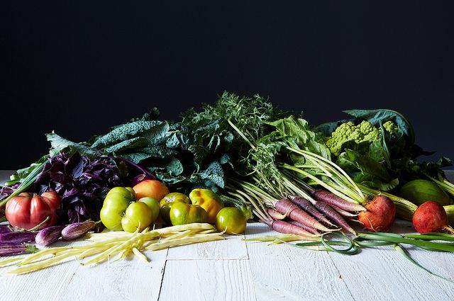
It was quite the task trying to pick a new Food52 logo color. Luckily Amanda was inspired by one of our veggie bounty photos by James Ransom (see above) -- namely that handsome kale in the corner. We took this photo, picked an area of the kale that we liked and zoomed in to a tiny square.

Shop the Story

Pixelated Kale from Food52

From there we took an eye dropper tool in Photoshop and tested out all the different greens that made up that little square of the kale. After much deliberation and testing of the logo against our new global navigation bar, our newsletters, and any additional goods the logo may appear on, we finalized on our new Tuscan Kale green color. Voila!

New Logo in Tuscan Kale from Food52

The updated logo look is part of a redesign of the main header and footer of the site (check out how light and nimble they look now!). These updates are in preparation for our new shop, Provisions, that we’ll be launching shortly, as well as to continue making headway towards a completely mobile/tablet-friendly website.

Tell us: what vegetables do you think deserve their own Crayola color?

See what other Food52 readers are saying.

  • Melissa Brander
    Melissa Brander
  • Sarah Q
    Sarah Q
  • Pegeen
    Pegeen
  • thirschfeld
    thirschfeld
  • jamcook
    jamcook
Food52 (we cook 52 weeks a year, get it?) is a food and home brand, here to help you eat thoughtfully and live joyfully.

30 Comments

Melissa B. August 11, 2013
The new logo and all looks great! I think my favorite food color is that of raspberries - it's a beautiful red.
 
Sarah Q. July 16, 2013
The golden zucchini and black raspberry sound fabulous together! I just pulled "rainbow" colored carrots from the garden yesterday and the array of pastel oranges and yellows are amazing.
 
Pegeen July 13, 2013
p.s. Like using the "green" color palette in your logo, for all the positive connotations
 
Pegeen July 13, 2013
Mazeltov on the design updates! In the spirit of helpfulness, have to agree with AmySarah and other commenters that given the smaller size of the logo in the nav bar, the green tint gets a bit lost and comes across as grey. (I love the Tuscan Kale green in the larger version in your editorial text but it's translating as grey on my display (in this case a 17-in Mac Book Pro, 1400x900). You might also have some trouble capturing the nuance of the green in printer's ink. I'd also have to agree the logo seems too diminutive in comparison to the ad sizes on the page. At first, I thought I was looking at a "secondary" page and clicked on the Food52 logo to see if it would go to a "main" page where the logo was more differentiated. In any case, nice work as always!
 
thirschfeld July 12, 2013
That is just about the same color as our dining room.
 
jamcook July 12, 2013
golden zucchini and black raspberry
 
amysarah July 12, 2013
Sort of a sage green...nice color, but where the logo is so small in the header, I don't think the color really 'reads' as much more than a cool grey. (Lovely shade where logo is large.) I think reducing the size of the navigation bar is fine, with one caveat: at least on my screen, the ad right below it occupies more real estate and is also more assertive than the site's identity - the elegant and subtle FOOD52 logo is proportionately tiny and sort of squished in the corner... just feels sort of hierarchically 'off' for the ad to feel dominant over site's identity.
 
Can I. July 12, 2013
I agree that the new logo is disproportionately small for the site, especially when compared to the size of the ads.
 
Jenn D. July 12, 2013
Oooh how cute!
 
Alanna K. July 12, 2013
Also - the header is repeating itself multiple times on a page, very distracting and covering up both content and sidebar ads - maybe just on Bloglovin's [stupid] frames??? - Safari 5.1
 
Alanna K. July 12, 2013
Looks very gray to me - like a cold and gloomy winter day. My own favorite color - rhubarb!
 
dymnyno July 12, 2013
Not a vegetable, but I love the deep purple-black color of cabernet sauvignon grapes.
 
mrslarkin July 12, 2013
love that color! global navigation bar is super tiny, so can't really pick it up on the small logo. Looks dark grey. Also, bottom of the logo is cut off on my view, fyi.

One of my fave color websites, totally addictive: http://blog.design-seeds.com/2013/07/12/beached-tones/
 
ChefJune July 12, 2013
...and where do we find the member profiles now?
 
Sarah J. July 12, 2013
The member profiles are at the top right of the site (just click on the user image thumbnail). Also, I would most definitely buy a crayon -- or a pot -- in "French breakfast radish."
 
ChefJune July 12, 2013
Peach is certainly a color, but is it a CRAYON color? French breakfast radish (such a happy shade of pinky-red).
 
rpenovich July 12, 2013
Honeydew, white radish, tangelo
 
Sasha (. July 12, 2013
Love it! Came out beautifully; nice and subtle.
 
Shalini July 12, 2013
Perfect colour.
 
Brette W. July 12, 2013
Ripe avocado, wild blueberry, nectarine, strawberry-rhubarb
 
Emma W. July 12, 2013
Oooo strawberry-rhubarb is such a pretty color.
 
Kenzi W. July 12, 2013
Garlic scape green.
 
Lindsay-Jean H. July 12, 2013
I was going to go with garlic scape green too! Love it.
 
Emma W. July 12, 2013
This makes me so happy, I love it all!
 
vvvanessa July 12, 2013
There should be a beet red, a beet yellow, and a stripey beet crayon. And whatever color one would call the color of purple carrots, which is that crazy pink-purple-orange.

Nice call on the kale green!
 
Brette W. July 12, 2013
Purple carrots! Great call
 
susan G. July 11, 2013
I'm happy with the practicality of the new header -- accomplishes everything in less space, and stays there being useful!
 
savorthis July 11, 2013
I was once similarly inspired by a Gourmet cover (which I still have on my bulletin board: http://imgc.allpostersimages.com/images/P-473-488-90/60/6012/E78B100Z/posters/romulo-yanes-gourmet-cover-september-2000.jpg). I did several websites and print pieces with that palette. I like the new kale logo...though I also liked the darker footer...
 
Sarah J. July 11, 2013
Is aubergine a Crayola color? The name, the color, and the food -- all are irresistible!
 
laurenlocally July 12, 2013
Aside from tuscan kale, I am with you on aubergine!