One of the oldest building materials, tile has the potential to transform a room—once you realize how versatile it can be.
People conventionally think of tile as something perfect for the backsplash or for the bathroom, a purely functional choice, but there are so many more ways to use it in the home: At Heath Ceramics we've seen it used on ceilings, on stair risers, and on counter bases. There aren’t that many elements in a design toolkit that give you as much flexibility as tile, and that’s why we think of it as something that can indeed "make the room."
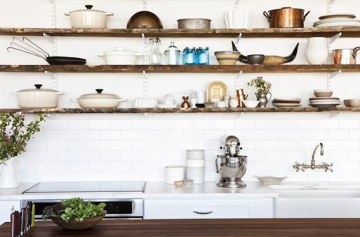
Tile allows you to play with texture, which means you're playing with light. With machine-made tiles, every tile is the same exact color, so you have the option to create a uniform, very clean, utilitarian look. With handcrafted tile, you have variation that's inherent in the manufacturing process, resulting in slight differences in shape and glaze—which can make installation a little bit trickier, but it results in a more interesting surface. Mix up glazes, staggering matte and glossy glazes, or even introduce dual or layered glaze pieces to play with texture even more.
Tile is not something you can or should toss out every couple of years. Done well, tile should engage with the architecture of a building, sitting in between function and decoration—it needs to be an integral part of the design. We love that tile is also one of the oldest building materials; there's such a sense of history to it, and a groundedness to it. Picking tile—particularly handmade tile—is a nod to that past, and a commitment to connect with it.
Rethinking tile and its possibilities can be a great deal of fun. Your task is to decide how you want to pull the space together, pick the right tiles and installation to get there, and take a few risks along the way. Here are some of our favorite ways to use tile unexpectedly in the home:
1. Think big, think unusual.
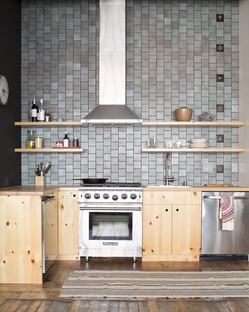
Extend a pattern of large tiles up to the ceiling in a backsplash: It can make a small space that much grander and even larger. Designed this way, the tile feels like it's part of the architecture, not just a surface element.
2. Create unity.
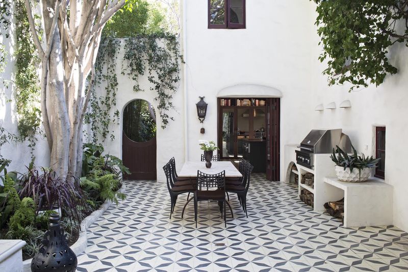
Used in areas where the indoors meets the outdoors, tile can blur boundaries and create unity in a room—it's very Californian, which is very much who we are. In this space, white walls and a lot of white in the tile pattern creates a seamless flow throughout the outdoor room.
3. Pay attention to grout.
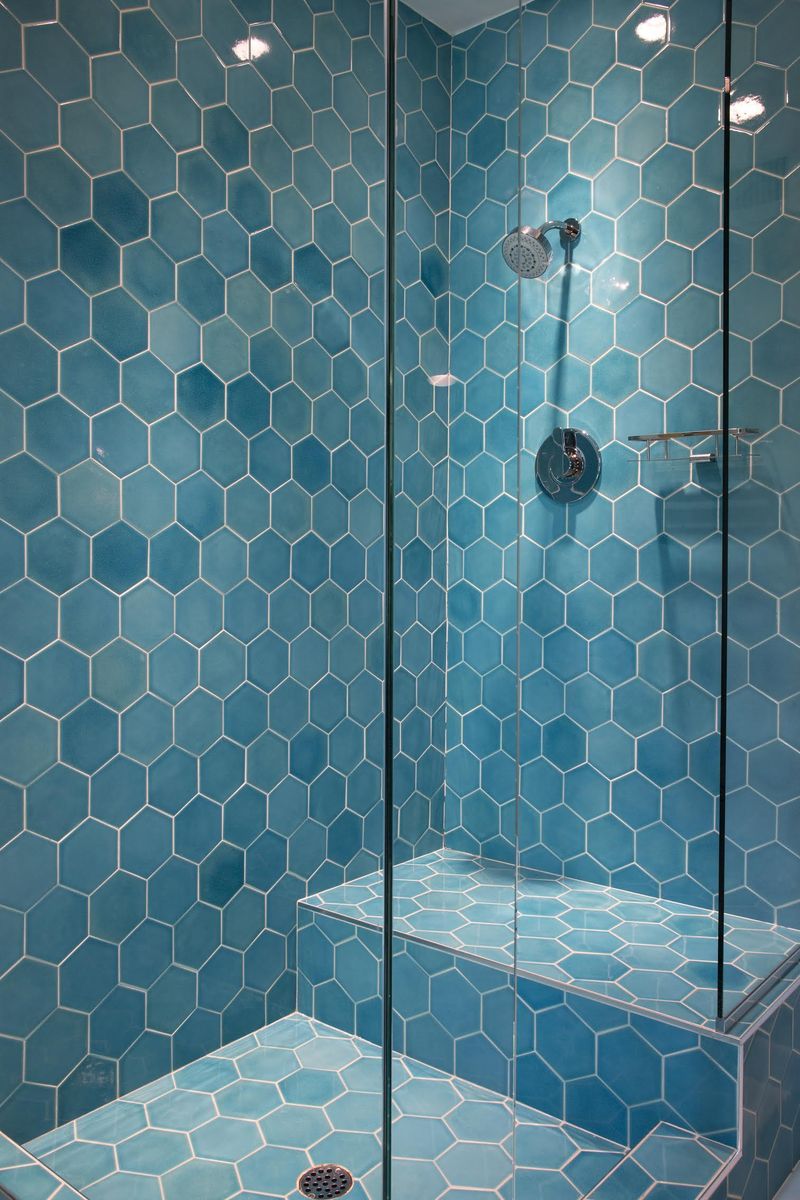
Grout’s the unsung hero of any tile installation and can completely change the look of the space based on what color you choose and how wide the lines are. If the space calls for a strong graphical pattern, choose a grout that’s as light and as high-contrast that’s possible.
A grout that contrasts with tile, like the one above, means that the pattern and shape of the tiles will predominate, while if you use a grout that's closer to the glaze, you'll have a more subtle pattern that emphasizes texture rather than pattern.
4. Rethink white.
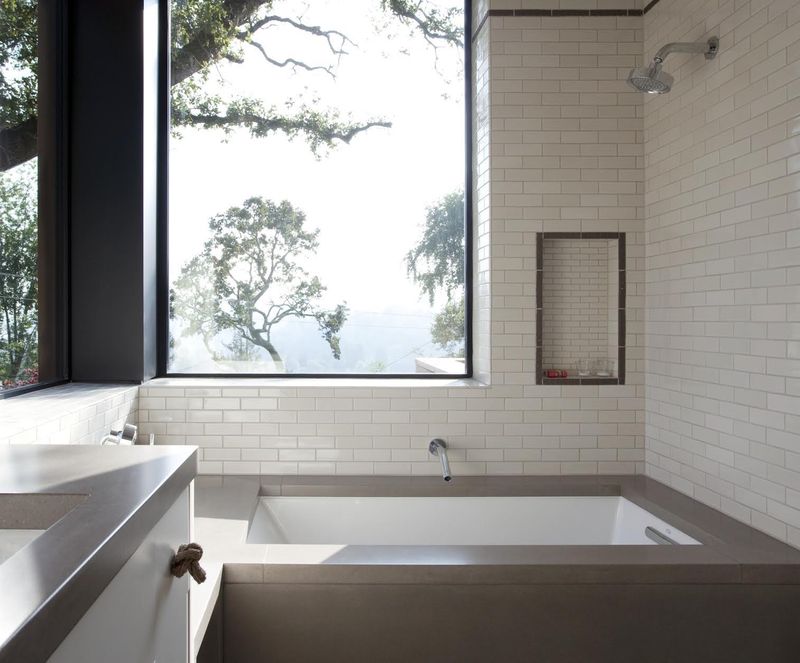
White is not boring, white is not cold. By combining shades of white, particularly when you use handcrafted tile, you can create a space that’s lean and minimal, or surprisingly rich and warm, as you can see in the bathroom above.
5. Create texture.
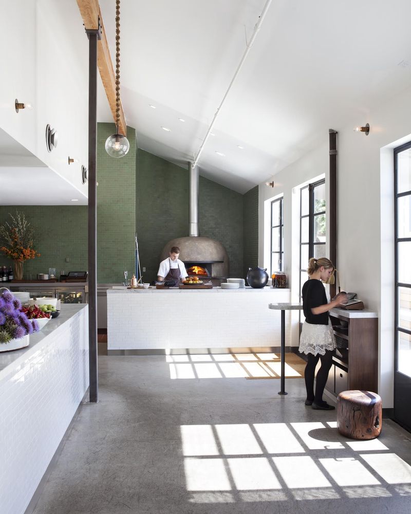
If you want to play with the conventional notions of what tile is—flat, perfectly reflective, uniform, functional—consider using handcrafted tile with minimal grout lines, as in this installation (above) at Farmshop. The effect is sophisticated and artistic, perfectly reflecting the food and values of the restaurant, and would be great in a home kitchen as well.
What's your favorite tile shape and how did you use it? Let us know in the comments!
Catherine Bailey is the Creative Director at Heath Ceramics, whose upcoming book Tile Makes the Room will hit shelves in a few short weeks.
First photo by James Ransom; second photo with large tile by Mariko Reed (designed by Catherine Bailey); Catalina House photo by Mariko Reed (designed by Commune); Hillside house photo by Mariko Reed (designed by SB Architects); Popp House photo with blue tile by Mariko Reed (designed by Popp Littrell); Farmshop photo by Mariko Reed (designed by Commune).

See what other Food52 readers are saying.