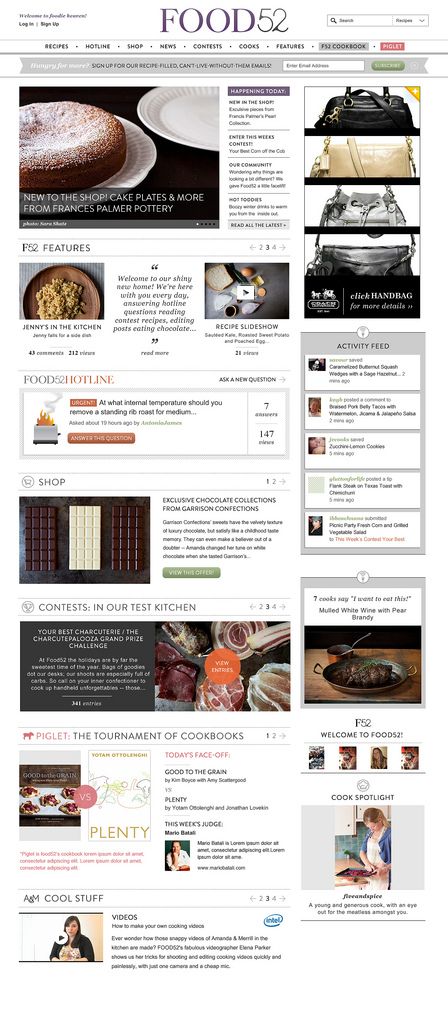
New Homepage Coming Soon!
Popular on Food52
104 Comments
Panfusine
February 7, 2012
The white background makes it look spacious, LOVE the page,
do we still contact [email protected] in case we stumble on bugs?
do we still contact [email protected] in case we stumble on bugs?
Lady B.
February 7, 2012
Actually, I wish you could settle into a format and stick with it for awhile. I prefer to peruse the articles, not spend my time figuring out how to navigate the ("once again new and improved!") site. Also, the video ad is very off-putting. Sorry to sound crabby - I love Food 52 (it's on my daily-read list), but the repeated changes feel a bit hyper - just appreciate what a great thing you've put together here and relax into it.
Amanda H.
February 7, 2012
We launched one total redesign of the site in October and just re-did the homepage last week (which we did because the homepage wasn't working as is). That doesn't seem too hyper to me, but we like to make sure the site is evolving. Hope you'll grow to like the new homepage.
garlic&lemon
February 6, 2012
I really like the new homepage, EXCEPT for the very loud video ad that automatically opens when my cursor floats over it even when I do not click on it. Can you make the ad stay closed unless we click on it? It makes it clumsy to navigate around the page. Thanks!
Tippy C.
February 6, 2012
I have to admit that I was thrown this morning when I logged in to Food 52 and an ad video (with loud sound) popped up and played before I could click out of it to go to the Piglet. I don't mind ads, but I don't like them intruding into my viewer unless I have opened them. (It was the Galaxy Note ad in your top right box). Frankly, it bugs me when the ads are moving around and the site is still. Too busy.
knitnbead
February 6, 2012
I love the new home page. It's like a Smorgasbord (did I spell that right?) of delicious goodies. So many decisions.......What fun!
madeinmb
February 6, 2012
The organization is great, but it is edging a little too close to "cupcake shop" aesthetic! Amanda, one of the really good things about food52 is that it hasn't been too cute.
jenmmcd
February 6, 2012
Thank you! I love it! Was going to send you a thank you note before I saw this article.
KirstenS
February 6, 2012
Oh, that makes so much more sense! Much easier to navigate. And your login bug seems to be fixed too.
Can I offer two items that I think could be improved? The floating share bar at the left is incredibly distracting to me. I keep wanting to swat it off the screen.
And about the emails: I love Food 52 for being a cooking community. I don't mind hearing occasionally about yummy/lovely things we should buy, but it seems like the "buy this" emails outweigh the "cook this!" emails.
yella
February 6, 2012
MUCH MUCH better! Congrats! I look forward to visiting the site more regularly now.
One thing though: I find that the font on the subheaders (eg PIGLET TOURNAMENT; CONTESTS) is lovely but very hard to read... perhaps up the contrast a bit?
One thing though: I find that the font on the subheaders (eg PIGLET TOURNAMENT; CONTESTS) is lovely but very hard to read... perhaps up the contrast a bit?
galsmu
February 5, 2012
Much better! So much easier to find things - some of us need focus!!! Thanks!
TheWimpyVegetarian
February 5, 2012
Great, great job on the redesign!!! I really like it a lot - it hits just the right balance for me.
mrathmel
February 5, 2012
Great re-design. I had actually avoided using your site more because I had so much trouble with it. The new design seems to be just right. Thank you!
susan G.
February 3, 2012
Fantastic redesign of the home page. It does what I want it to do, and elegantly. Thanks!
creamtea
February 1, 2012
I'm wondering, when the contests are finished and all's said and done, can the CP's be mentioned in connection with the contest as part of the whole? I have a hard time navigating that; I want to know the winner, runner-up and finally the cp's of a given contest.
Amanda H.
February 2, 2012
We may be able to find a place to do this in the contest archives section. Agree that it would be nice to have it all together. But will take some technical work because the community picks are done through our blogging system, not our contest system (because community picks were added after we launched the site).


See what other Food52 readers are saying.