New Homepage Coming Soon!

February  4, 2012


UPDATE: The new homepage is up -- check it out and let us know what you think!

We like to mix it up around here. One day we might present you with a top-to-bottom redesigned site. The next day that new site might break and refuse to load. We may hide your recipes for a few weeks, and then slyly add them back to your profile pages, as if nothing happened. Hope we're keeping you on your toes!

Shop the Story

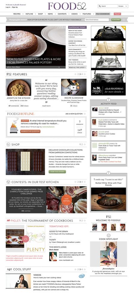
This week, we thought we'd try something different: giving you a preview of what's to come. We heard your misgivings about the home page. We shared some of them, too. So we went back to the drawing board and tried to find a way to combine the sense of discovery found on the current home page with a sense of organization. In other words, we took a colorful but messy sock drawer and matched all the socks and put them in neat rows. Hope you like what you see here (keep in mind this is an approximation of what we're planning). Either way, we look forward to hearing from you!

- Amanda


New Homepage

See what other Food52 readers are saying.

  • MeghanVK
    MeghanVK
  • Panfusine
    Panfusine
  • Lady Bilgewater
    Lady Bilgewater
  • ATG117
    ATG117
  • garlic&lemon
    garlic&lemon
Amanda Hesser

Written by: Amanda Hesser

Before starting Food52 with Merrill, I was a food writer and editor at the New York Times. I've written several books, including "Cooking for Mr. Latte" and "The Essential New York Times Cookbook." I played myself in "Julie & Julia" -- hope you didn't blink, or you may have missed the scene! I live in Brooklyn with my husband, Tad, and twins, Walker and Addison.

104 Comments

MeghanVK February 8, 2012
Big fan of the "Features" tab up top and the overall cleaner look. Nice!
 
Panfusine February 7, 2012
The white background makes it look spacious, LOVE the page,
do we still contact [email protected] in case we stumble on bugs?
 
Lady B. February 7, 2012
Actually, I wish you could settle into a format and stick with it for awhile. I prefer to peruse the articles, not spend my time figuring out how to navigate the ("once again new and improved!") site. Also, the video ad is very off-putting. Sorry to sound crabby - I love Food 52 (it's on my daily-read list), but the repeated changes feel a bit hyper - just appreciate what a great thing you've put together here and relax into it.
 
Amanda H. February 7, 2012
We launched one total redesign of the site in October and just re-did the homepage last week (which we did because the homepage wasn't working as is). That doesn't seem too hyper to me, but we like to make sure the site is evolving. Hope you'll grow to like the new homepage.
 
ATG117 February 7, 2012
Love the new home page. Phenomenally easier to look at!
 
garlic&lemon February 6, 2012
I really like the new homepage, EXCEPT for the very loud video ad that automatically opens when my cursor floats over it even when I do not click on it. Can you make the ad stay closed unless we click on it? It makes it clumsy to navigate around the page. Thanks!
 
Tippy C. February 6, 2012
I have to admit that I was thrown this morning when I logged in to Food 52 and an ad video (with loud sound) popped up and played before I could click out of it to go to the Piglet. I don't mind ads, but I don't like them intruding into my viewer unless I have opened them. (It was the Galaxy Note ad in your top right box). Frankly, it bugs me when the ads are moving around and the site is still. Too busy.
 
knitnbead February 6, 2012
I love the new home page. It's like a Smorgasbord (did I spell that right?) of delicious goodies. So many decisions.......What fun!
 
sexyLAMBCHOPx February 6, 2012
It would be great if we could "sae" videos and hotline questions.
 
madeinmb February 6, 2012
The organization is great, but it is edging a little too close to "cupcake shop" aesthetic! Amanda, one of the really good things about food52 is that it hasn't been too cute.
 
jenmmcd February 6, 2012
Thank you! I love it! Was going to send you a thank you note before I saw this article.
 
Sagegreen February 6, 2012
Good improvements!
 
KirstenS February 6, 2012
Oh, that makes so much more sense! Much easier to navigate. And your login bug seems to be fixed too.

Can I offer two items that I think could be improved? The floating share bar at the left is incredibly distracting to me. I keep wanting to swat it off the screen.

And about the emails: I love Food 52 for being a cooking community. I don't mind hearing occasionally about yummy/lovely things we should buy, but it seems like the "buy this" emails outweigh the "cook this!" emails.
 
yella February 6, 2012
MUCH MUCH better! Congrats! I look forward to visiting the site more regularly now.

One thing though: I find that the font on the subheaders (eg PIGLET TOURNAMENT; CONTESTS) is lovely but very hard to read... perhaps up the contrast a bit?
 
galsmu February 5, 2012
Much better! So much easier to find things - some of us need focus!!! Thanks!
 
TheWimpyVegetarian February 5, 2012
Great, great job on the redesign!!! I really like it a lot - it hits just the right balance for me.
 
mrathmel February 5, 2012
Great re-design. I had actually avoided using your site more because I had so much trouble with it. The new design seems to be just right. Thank you!
 
Jaynerly February 5, 2012
I like this much better, so pleased! I had been avoiding before!
 
susan G. February 3, 2012
Fantastic redesign of the home page. It does what I want it to do, and elegantly. Thanks!
 
TasteFood February 2, 2012
I am loving the new homepage. Well done!
 
creamtea February 1, 2012
I'm wondering, when the contests are finished and all's said and done, can the CP's be mentioned in connection with the contest as part of the whole? I have a hard time navigating that; I want to know the winner, runner-up and finally the cp's of a given contest.
 
Amanda H. February 2, 2012
We may be able to find a place to do this in the contest archives section. Agree that it would be nice to have it all together. But will take some technical work because the community picks are done through our blogging system, not our contest system (because community picks were added after we launched the site).
 
Blissful B. January 31, 2012
One more question: are you considering adding subscribe-unsubscribe buttons to both the website & hotline threads? Ones that aren't connected to the comment box? That would be so much more functional.
 
Amanda H. February 2, 2012
We weren't, but happy to consider it -- it would be great if you could point us to a site that does this well so we can study their implementation. Thanks, in advance.
 
Blissful B. February 2, 2012
I'm most familiar with it on internet forums & bulletin boards. Here's one example:
http://www.wpuniverse.com/vb/showthread.php?33910-How-to-Subscribe-or-Unsubscribe-to-a-Thread
 
Blissful B. February 2, 2012
And another example is Facebook. If you belong to a facebook group, they give the option of following or unfollowing a comment thread. Join any group on facebook to see an example.
 
AEC January 29, 2012
Hooray! Looking forward to home page redesign. Thanks for taking comments to heart and having a the mindset and willingness to keep making the site better. I do echo what others have said about the new scrolling bar and BEG you to get rid of it. I think most people are savvy enough to look for this feature at either top or bottom of a page.
 
mike S. January 28, 2012
The thing I like about the current FOOD52 look is that dramatic use of great food photos in an un constrained layout. I enjoy searching and discovering interesting "Finds' as i search your home page . . . the effective use of white space and large images works wonderfully!!!
 
wssmom January 27, 2012
Oh, and one more thing: I used to like going to a cook's home page and looking at the recipes and seeing which ones were editors (community) picks, which ones were winners and semifinalists, etc. Any chance of that returning? Thanks!
 
Amanda H. January 29, 2012
We're working on those pages now -- will put this in the notes. Thanks.
 
jenniebgood January 27, 2012
p.s. - Also - any chance the "print recipe" button could also be tweaked to allow the recipe photo to be printed?
 
jenniebgood January 27, 2012
Hi -Love the site and I think it's only getting better! Is it at all possible to add a feature allowing the reader to print comments as well as the recipe? I like printing the comments sometimes (the F52 community adds such great tips/techniques/feedback that are so helpful and in my mind really become part of the recipe). I sometimes copy and paste the comments into a word doc, but every comment then prints with the commentor's profile picture as well. It can get messy...
 
Amanda H. January 27, 2012
Thanks so much -- we will add this request to our list of ideas to discuss. Most people don't want to print anything but the recipe (not even the photo) so that's why we've designed the print parameters the way they are. But it's good to know that this isn't the way everyone wants it. Thanks for letting us know.
 
wssmom January 25, 2012
Thanks so much! The former design really had me feeling out of the loop and very disconnected .... I've been missing my daily Food52 fix!
 
Blissful B. January 24, 2012
It looks wonderful! Much easier on the eyes & much easier to navigate. Thank you for listening to our feedback. Y'all do know how to make us feel part of everything.

2 questions: I see News on the tab bar - does that mean it's coming back? I miss it! And any chance you'll limit the activity feed to comments & remove the not-so-interesting flurry of saved & viewed activity?
 
Amanda H. January 24, 2012
Sadly, news isn't coming back any time soon. And the activity feed we'll continue to tweak until it's just the right balance of things. No promises, but we do hear you on the saved and viewed.
 
Bevi January 23, 2012
Can we delete duplicate comments like the 4 I just made?
 
Amanda H. January 23, 2012
Yes, done!
 
Bevi January 23, 2012
So much nicer!
 
susan G. January 23, 2012
I looked at the preview page and felt a sense of calm come over me. I think you have achieved both the sophistication you want and the usefulness we need. Looking forward to working with it.

About that moving box -- I had to go to a recipe to see what it was! It wasn't there last night. The concept is good, but maybe the realization doesn't work. (Oops, now I see it here too. Maybe I'm just so focused on the text...)
 
fiveandspice January 23, 2012
Oh, this does look easier to read! And, I agree with Mrslarkin, an index to the features is so helpful. I have no idea if this is related to the ongoing set of changes or not, but when I receive notifications about comments in my email now, it no longer says who wrote it or which recipe/article it is a comment on (it still gives this info if it's a comment about one of my recipes though). You have to click the link to go to the full thread to see what conversation it's a part of. And, I don't have time to click over for each notification, whereas if it says in the email which conversation it's part of and who is saying it, I can usually remember exactly how/why it fits in, who it's responding to, etc. without having to go and check. Thanks for continuing to monkey around and strive towards the best site/community possible!
 
susan G. January 23, 2012
On the issue of the missing ID for notifications -- put the cursor over the linked answer and (on my computer at least) the link has the 'name' of the question.
 
fiveandspice January 23, 2012
Oh, cool! That is helpful! I would still also like to be able to see who made the comment as well though. I'm very demanding, I know! :)
 
Amanda H. January 23, 2012
We'll take a look -- thanks.
 
cookinginvictoria January 24, 2012
Regarding e-mail notifications, I too was seeing the name of who made the comment and what thread the comment appeared in, but a fwe days ago that info disappeared. I miss it -- it's difficult to piece together the comment thread w/o this info unless you go back to the site and visit that comment thread, which I don't tend to do with every e-mail notification. Thanks for looking into this, Amanda.

P.S. Hope that the "News" feature will return. I loved it too.
 
Amanda H. January 24, 2012
Email notifications should be fixed now. Please let us know if they aren't for you. Also, very sorry but news isn't returning anytime soon. We miss Fran and Shelly, too!
 
fiveandspice January 25, 2012
They are! THANK YOU!
 
mrslarkin January 23, 2012
Lookin' good. Thank you, guys! So is the "features" tab replacing the "articles" tab? And will the "features" tab be more like an index to all the features?? (say yes, please!)

I agree, the scrolly thing to the left that keeps following me is creepy. i keep wanting to see how fast I can scroll up/down, to see if I can out-scroll him. ;)

I love that you added the Pinterest button! Or as my husband likes to call it, the "random-crap aggregrator button."
 
Amanda H. January 23, 2012
Yes, articles will be "features" both on the page and in the navigation. We still have some work to do once you get to the main features section to make it easier to navigate to specific columns, and also we need to add back comment counts, etc.
 
Hilarybee January 23, 2012
It looks great! I'm glad to see Food52 evolving. I appreciate the effort to listen to comments and suggestions and make changes.
 
Amanda H. January 23, 2012
Thanks!
 
Panfusine January 23, 2012
Do we cooks still get to retain out purple pies?
 
Panfusine January 23, 2012
I meant 'OUR'
 
Panfusine January 23, 2012
I meant 'OUR'
 
Amanda H. January 23, 2012
Yes -- and there will be some improvements to the pies in coming months.
 
Ellesbelly January 23, 2012
Are you guys working on a mobile site? This one is hard to read on the phone, not a big issue, just would love to read the site more on my train commute. Otherwise, I'm loving this new layout!
 
Amanda H. January 23, 2012
That's on our short list. After we launch the new home page, we're going to do some back end work on our main pages, and then focus on Hotline ... and then mobile site. We'll get there, promise.
 
creamtea January 23, 2012
Can we add the possibility, when editing recipes, of editing/switching formats (simple to 2-step recipe, for example)? That hasn't been working for me.
 
Shalini January 23, 2012
Hi Amanda,

I like the amount of whitespace. I think this'll totally facilitate readability. The black and white contrast is nice too. My original recipe, under my last profile of S.Roy for Figgy Duck, never made it back...I had changed my last e-mail address and anyhow my new profile has worked well. Thanks for the heads-up about the redesign.
I like that you don't necessarily have to click on everything to see what the most current content is, you can just scroll down the page. Very reader-friendly!
 
Amanda H. January 23, 2012
Sorry to hear you lost that one. We can look for it again -- email us at [email protected]
 
MrsWheelbarrow January 23, 2012
I am loving the "Features" box. Great way to organize your brilliant contributors!
 
Amanda H. January 23, 2012
Glad you do and we might need to make it 2 rows deep because we have so many features now.
 
pierino January 23, 2012
Could we lose Larry the Cable Guy??
 
Amanda H. January 23, 2012
Sorry about that -- he's probably with us for a few more weeks.
 
ChefJune January 23, 2012
The new home page looks great! ;)
 
Amanda H. January 23, 2012
It was like a slow braise. Just needed time.
 
susan G. January 23, 2012
In lieu of a 'like' -- Amanda, brilliant analogy!
 
DianneV January 23, 2012
Please remove the side ads that activate video--- incredibly annoying. Other than that I love this site.
 
ChefJune January 23, 2012
I agree with Dianne. SO aggravating!
 
Amanda H. January 23, 2012
The ads activate when your cursor hovers for 2 or more seconds -- if you can keep your cursor away from the ads, they won't activate. The hover delay is pretty typical with video ads now. Hope this info will help you work around them.
 
sexyLAMBCHOPx January 23, 2012
May be helpful if you could add a tab for "contact the editors" with the email address so you could click explain when & why to contact you should - technical difficulties, etc. Agree with other that the scrolling of a page is endless, which it was shorter. To that end, appreciative of this fun, useful, and free site.
 
Panfusine January 23, 2012
Looks good! When does this version go online?
 
Amanda H. January 23, 2012
Probably in about a week. Will update this post to let everyone know when we have a firm date.
 
rukan January 23, 2012
i like it more ogenized
 
cookinginvictoria January 23, 2012
I like it -- the home page looks very snazzy and sharp! The bigger text boxes and the specific titles for each element on the home page really adds a "sense of organization" and clarity, yet there is lots of content to explore, so the "sense of discovery" is still there too, at least for me. I really like the more descriptive hotline teaser too. Looking forward to seeing the new home page when it launches. Thanks for giving us a sneak peak!
 
feucht22 January 23, 2012
Love the videos. Will they be having a permanent spot on the bottom, per the preview above?
 
Amanda H. January 24, 2012
Yes, actually we're soon going to be doing many more videos (!) and they'll appear in more than one spot on the home page. May take a few weeks before they start appearing. Glad to hear you like them!
 
mcs3000 January 23, 2012
Cool preview! Looks great - clean, sharp. I'm pleased you are not doing away w/ the "sense of discovery" in the current page. It's one of the features I liked most about the redesign. I agree that the floating comments/social bar is distracting as you navigate around a page, but I hope you don't do away with it completely (nice to see Pinterest added). Looking forward to seeing the new homepage go live.
 
Amanda H. January 24, 2012
Thanks!
 
TheWimpyVegetarian January 23, 2012
I like the new proposed format VERY MUCH! It covers everything going on without sensory overload. Thanks SO much for listening to us!! Any chance top buzz will come back that highlights the most popular recipes over the last 2 weeks?
 
Amanda H. January 24, 2012
Really glad you like it -- and most buzz is back (as of this week) in search results. The filter "Popular Recipes" is a close approximation of "most buzz" but we need to tweak it yet.
 
ATG117 January 23, 2012
And one last thing, I very much concur with lazychef. I find the scrolling box pretty terrible. It actually makes me dizzy. Sorry for the complaint.
 
ATG117 January 23, 2012
Looks great! Will older recipes like the "this time last year" still be featured on the homepage. That feature was one of the things I liked about the redesign because it often highlighted recipes that I hadn't previously seen. That said, I prefer a less cluttered homepage. I personally wouldn't mind the shop feature being smaller. That is something where if I'm interested in what's in the shop, I'll tab there. Then again, I understand why you would want to highlight it.
 
mariaraynal January 23, 2012
I really enjoyed the "this time last year" feature too -- it often spotlighted great recipes I wanted to make but never got around to ...
 
Amanda H. January 24, 2012
Yes, "This Time Last Year" and some other like modules will be on the homepage in a section called "Time to Eat!" -- it didn't make it into this design round but it's in the works. And sorry you don't like the scrolling box. Since we implemented it, it has vastly increased the sharing of articles and recipes, and we like/need that.
 
Ann January 23, 2012
Any chance the contests (and other things that have been removed from the RSS feed after the first re-design) can come back to the RSS feed as part of this improvement?
 
Blissful B. January 23, 2012
I agree. I follow F52 through Google Reader & miss knowing about the contests.
 
lazychef January 22, 2012
New layout looks like an improvement! Looking forward to it.

And while I'm here- one minor quibble about the current site. I really, really dislike the floating box on the left of the page (the one that lists the number of comments and has links to facebook and whatnot). It's incredibly distracting as you scroll and it jerkily follows you, and it actually doesn't even show up properly in my window (I use firefox). Any chance we can abandon that feature?

Thanks and keep up the good improvements!
 
Amanda H. January 22, 2012
Thanks for your note! As for the scrolling box, we just added that a few days ago, so we need to make some adjustments for all browsers (I also use Firefox and have the same issue). The idea is for you to be able to share/print/email an article or recipe from where you are on the page, rather than having to scroll all the way to the top. We appreciate your feedback -- we did it as an experiment and we'll give it a couple of weeks before we decide whether or not to keep it.
 
Greenstuff January 24, 2012
The scrolling box just showed up for me today (on Chrome) and I'm sorry but absolutely hate it! So distracting. I kept looking for a way to turn it off. If you need something to stay with us, why not have it seemingly anchored at the top or bottom rather than zipping along on the side?
 
hardlikearmour January 22, 2012
Nice improvement in the layout! Can't wait to check it out when it launches.
 
mariaraynal January 22, 2012
Really pretty and nicely organized! If only my sock drawer looked so good...
 
drbabs January 22, 2012
Wow, Amanda, Thank you for listening to us...it looks great.
 
Amanda H. January 23, 2012
Thank YOU for all the helpful feedback.
 
boulangere January 22, 2012
It looks great! Duplicates are gone, space is filled, but not stuffed, not cluttered. It looks like each section is larger and can be read more easily. Great idea!
 
Sam1148 January 22, 2012
Can we haz edit back pleeze?
 
SKK January 23, 2012
I am with Sam.
 
Amanda H. January 24, 2012
Do you mean on Hotline? There is an edit button for questions, just not responses. Do you mean responses?
 
boulangere January 22, 2012
Any chance you could make the picture larger? It's so small that it's difficult to read. Thanks!
 
Amanda H. January 22, 2012
Tried to but that's the largest I could get it.
 
boulangere January 22, 2012
Thanks, Amanda. I'll grab my magnifying turtle!
 
Greenstuff January 22, 2012
Ctrl+ as many times as you want if you're on a PC, then Ctrl- to get it back down to size
 
Panfusine January 23, 2012
ctrl + makes the rest of the text gets magnified, but beyond a certain point, the image actually shrivels up!
 
lizziebeth January 22, 2012
... much better! easier to see different sections immediately