How-To & Diy

Food Styling 101

by:
June 26, 2012

Inspired by conversations on the FOOD52 Hotline, we're sharing tips and tricks that make navigating all of our kitchens easier and more fun. Since we're fine-tuning our recipe writing this week, we thought it'd be nice to talk about food styling, too. 

The kitchen is wrought with sensory experiences: smell, sound, taste and touch are integral to how we interact with food. But, as they say (and we agree), “You eat first with your eyes.” It's true that even the most delicious recipes can fall flat if they lack a visual allure.

Shop the Story

But photographing food is a lofty practice, and invoking all five senses by way of just one is easier said than done. Lucky for us, the talented photographers at FOOD52 were kind enough to share some tricks that will make people salivate at the mere sight of your food -- as they should.


Wise Words:

"The thing you really need to do before you even decide to make a picture of food is learn how to plate. The best photo in the world cannot make bad-looking food look good. I don’t care what app you use to try to hide that fact -- it won’t work.” -- Tom Hirschfeld

The wise thirschfeld speaks the truth, but you don't have to be a professional food stylist to execute mouthwatering shots. Here's what you need to know: 

Consider your surface and space: "Plating" is not just about how food looks on the plate -- it involves the entire stage for the scene. It might not even involve a plate at all. The surface you choose will dictate the atmosphere of your shot. Natural wood, rustic slate and textured paper all have very different effects. Use a canvas that complements the nature of the food. Play with unique textiles and serving vessels -- you can do a lot to transform that north-facing window sill you use for all of your shots. 

  
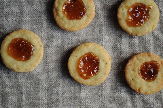
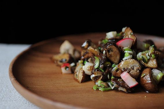
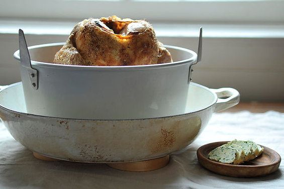
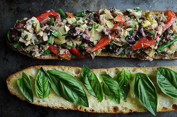
Note the differences in the photos above -- three of them were taken in the same space.

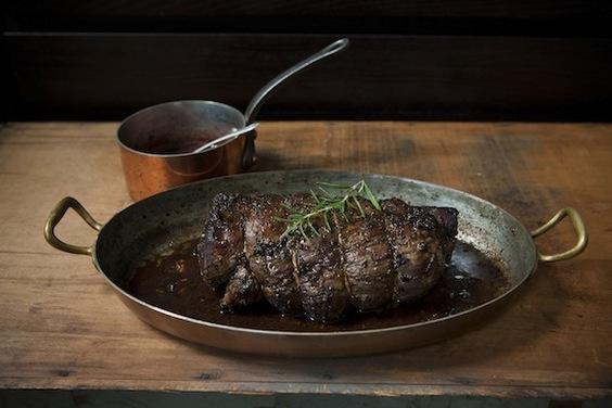
Think about your background: dark backgrounds will give your shot a dramatic effect (especially when contrasted with a light subject matter), while a window in the background will lend softness and depth. 

 
Moody mushrooms with a dark background (left); a delicate chicken with a soft, light background. 

Wise Words:

"Less is more. When learning, it's best to keep things simple. Styling can be overdone and it's truly a difficult job. Use simple linens, and look for interesting surfaces. I use random things from flea markets, including old crates or drawers. Also, when you're plating food, smaller portions tend to look better." --Nicole Franzen

"Not everything has to be on a plate. Think outside the box and consider your options. You may want to do some action-type shots, or ingredients, or on-a-sheet-tray-type stuff. I still consider this plating. Remember, you are building a style." --Tom Hirschfeld

“Don't let the background overpower the food. You might want to re-think that red and white gingham tablecloth as a backdrop for your fruit salad.” --James Ransom


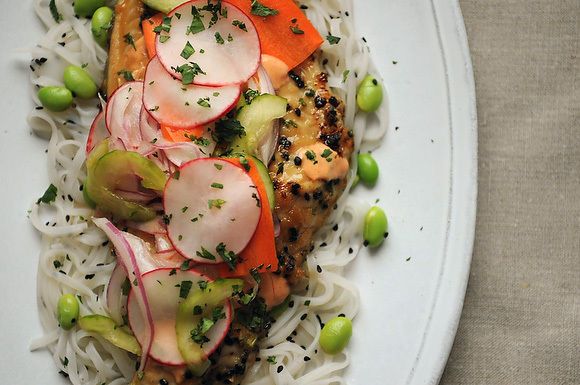
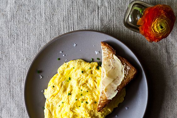
Subject Placement: Sometimes a composition is effective when the subject is in the center of the frame, other times when it's at the edge. A slightly off-center composition is often more interesting than one that is perfectly symmetrical. Off-center placement works really well for the bright dish below. 

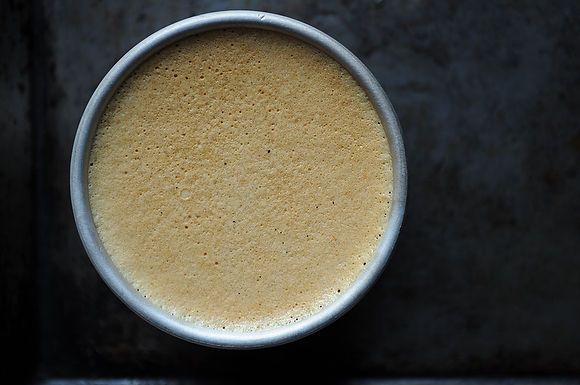
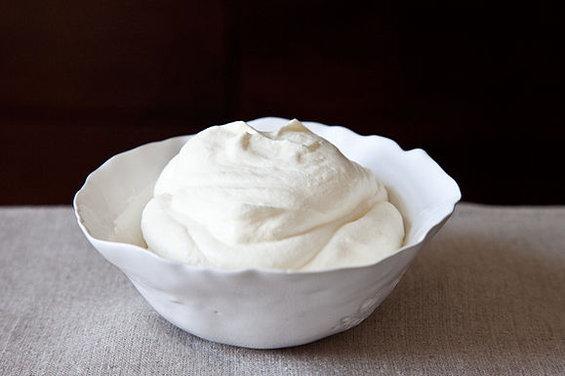
Negative Space: Don't be afraid to leave empty space around the food or plate. It gives the subject room to breathe and creates a sense of environment. The pudding below is a great example of bare-bones styling that is anything but boring. 

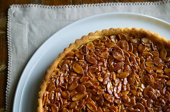
Framing: You don't necessarily need to get the whole plate or bowl in the frame. You want to expose enough to give the viewer a taste, but leave them craving more. 


This photo shows just enough of the tart to make you want to try a piece.

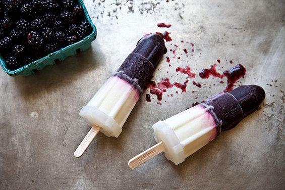
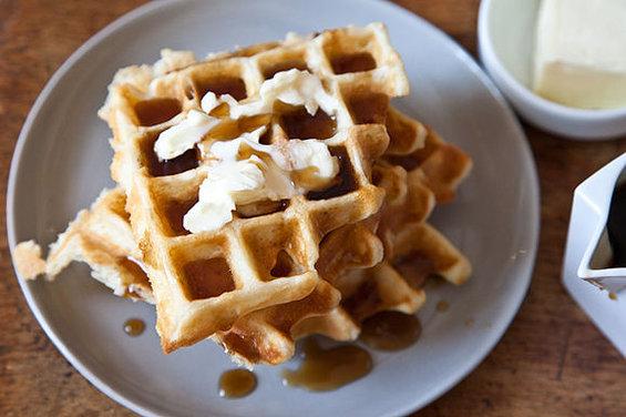
Imperfections can be stylish: Some of the most interesting compositions have a little mess -- stray crumbs, spilled sauce, a dirty fork. These are signs that the food is real and natural (aka ready to eat right off the plate!). The popsicles below are begging to be enjoyed. And the splashes of maple syrup make already appealing waffles even more enticing. 


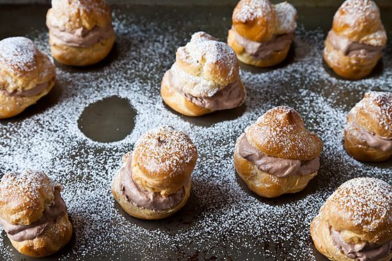
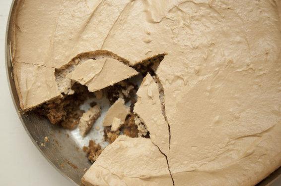
Tell a story: Take a bite out of that crostini, a spoonful from that custard, a slice from that pie (or a creampuff off that baking sheet). Like crumbs and spills, these moments give a sense of active reality to your composition. Removing an element from the shot also interrupts the spatial patterns and engages the viewer in an exciting way. 


Or try using a few simple garnishes and complementary props to present it more in the style of an Old Master's still-life


Wise words:

"Don't shortcut the food so it looks better on the plate. People want to be able to replicate your picture, so don't lie to them by making a false dish for a photo. Try to use the freshest, most blemish-free ingredients you can afford or find. It will make a difference in how your plates look. --Tom Hirschfeld

"Have an idea of what you want, create an image for your food that you want to promote, and believe in that image." --Tom Hirschfeld

Tomorrow we'll share some basic tips for food photography. Stay tuned!

See what other Food52 readers are saying.

  • LeBec Fin
    LeBec Fin
  • Katie Workman
    Katie Workman
  • TheHealthyApple
    TheHealthyApple
  • Conor Bofin
    Conor Bofin
  • Ms. T
    Ms. T
Weldor of palate + palette. Senior Designer @ Bon Appétit

19 Comments

LeBec F. January 3, 2014
well, better late than never (on my part, that is. i just found this and it was done 2 yrs ago!). What a terrific piece.Loved all the different aspects you covered.While I was familiar with most of the points, I particularly appreciated the Tell a Story and Imperfections topics. I was surprised that you didn't mention 'overhead' v.s. 'side' shots, because it has seemed on 52 that you favor the former, and that's something new for alot of newbie photographers. Hope you'll include more specific technical recommendations, and a long feature on lighting ( Oh, and food surfaces.)Thx so much for the great work!

 
Katie W. December 21, 2013
gorgeous and very well presented.
 
TheHealthyApple June 30, 2012
Fabulous post; thank you for this!
 
Conor B. June 28, 2012
Thank you so much for the wise words. I need to do some thinking...
Best,
Conor
 
Ms. T. June 26, 2012
Great tips, thanks for sharing!
 
Pegeen June 26, 2012
Useful, helpful information! I have no personal connection to her (except for loving her work), but thirschfeld & other lovers of Old Masters food paintings might want to check out Paulette Tavormina's work. For example:
http://www.tavorminaphotography.com/p849673867#h86748ca

Thanks for a great article. Looking forward to the next installment.
 
kitchenwlittleb June 26, 2012
Beautiful shots. Although I love doing photography, I still struggle with food photography, particularly with lighting. I think that's the true key to making it all work is having good lighting. Often times the first piece of advise is "natural light," however for amateur food bloggers/photographers, we're shooting at night. Eventually I know I'll have to invest in good lighting for night shots, but we'll get there.

Regardless, tips are always appreciated and those pictures are things of beauty!
 
Kitchen B. June 26, 2012
Some food bloggers recommend lowel ego lights, which are supposed to mimic daylight for night use. Best place on recommendation was amazon.com for a long time. Cheers.

Alternatively, keep a 'hero' (small) portion of your food aside and photograph it in daylight.
 
roland.hu June 26, 2012
Great article! I've lately become more interested in food photography and this was a great introduction! Thanks so much and looking forward to tomorrow's article.
 
Creative C. June 26, 2012
Love this sentence, "Don't shortcut the food so it looks better on the plate." - I think some food photographers might laugh themselves silly at what some of us do to get that shot. The family waiting in the kitchen for a meal means that real food as it really looks is on that plate. I once had a class with a food stylist and though it was interesting it was not really all that helpful. I'll not be putting any denture cream into anything in the near future. :)
 
Salt T. June 26, 2012
EXACTLY what I was looking for when I posted my question about this on the Hotline yesterday! Wonderful, thank you!
 
Amanda H. June 26, 2012
You ask. We answer. :)
 
thirschfeld June 26, 2012
The painting, "Breakfast" pictured in the Old Master's still-life link is sex on the table. Can't help myself I have always seen it that way.
 
alasully June 26, 2012
true that.
 
pattitude1 June 26, 2012
I love this, thanks so much, I too struggle with photographs <3
 
suoz June 26, 2012
I kept hoping the photos would be hyperlinked to recipes. I'm drooling!
 
Sasha (. June 26, 2012
Fantastic words and examples! I love how the edge of the almond tart is echoed in the little crochet of the fabric below it. So pretty. My absolute favorite is the cream puff one... the missing one revealed in the negative space is so perfect.
 
meganvt01 June 26, 2012
I love this column and I'll be looking forward to the rest of the week - I always struggle with making my food look good in a photo and I appreciate the tips!
 
Kristy M. June 26, 2012
So glad you liked this!