Chili isn't at the top of the "naturally glamorous cuisine" list. The process of letting ingredients stew in a pot for several hours does wonders to the flavors, but often takes a toll on the dish’s visual appeal. Save for a rogue carrot or bright pepper emerging from the depths, chili typically has a ruddy brown tinge, thanks to the melange of spices, meat and beans swimming in the pot. Delicious, but not sexy. Colorful garnishes become essential for glam (yes, that chopped cilantro and grated pepper jack crowning your bowl are as much for visual interest as they are for flavor). Vessels are important too: something light and neutral (a white or cream) will best contrast a dark chili and help balance its bulk.
These three FOOD52ers have worked the angles to capture chili at its best. Focused, well-lit and thoughtfully composed, their shots are a testament to the fact that a bowl of chili can look as good as it tastes.
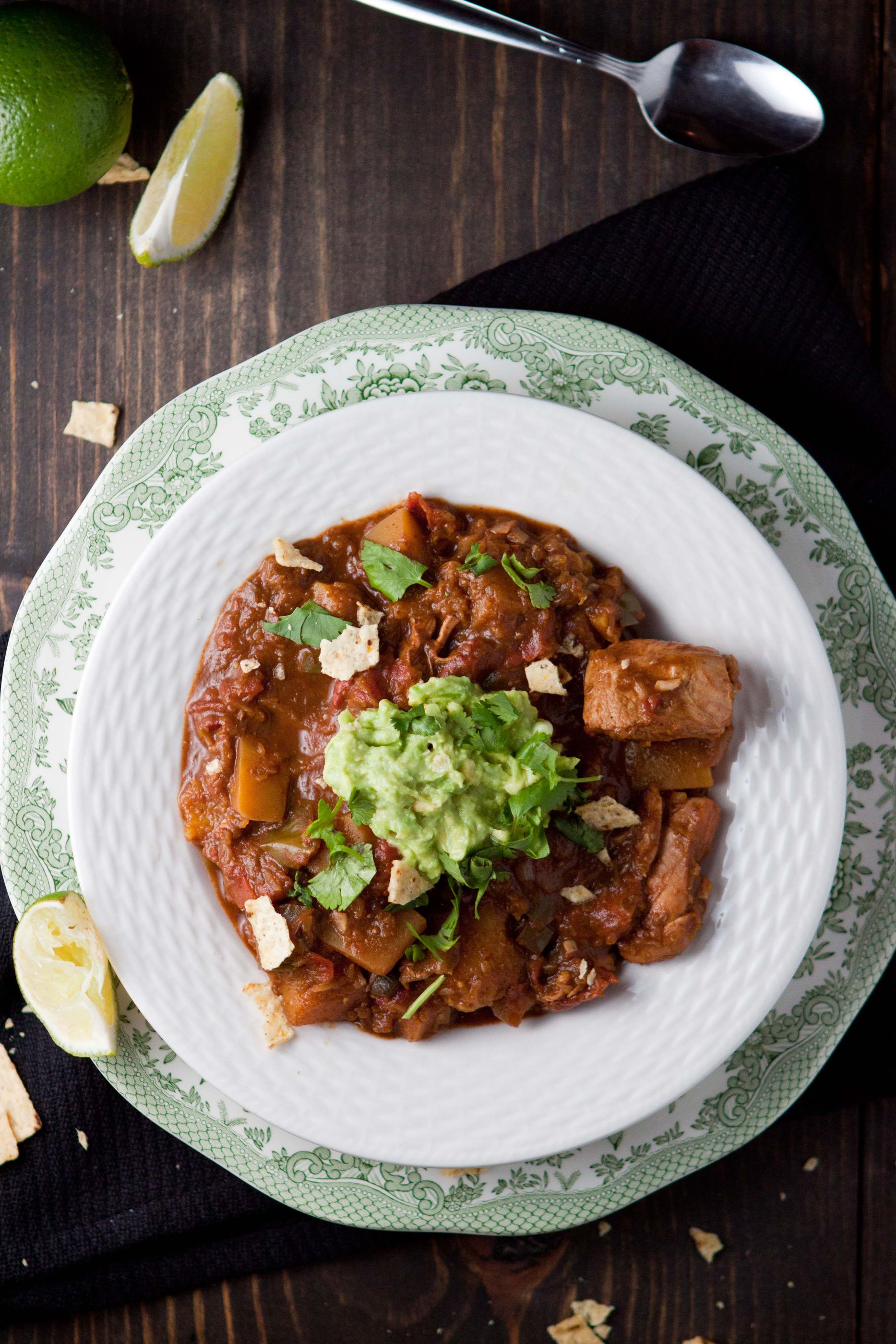
In her shot of Holy Mole Chicken Chili, fiveandspice takes an overhead approach, capturing the details of her dish through a layering of concentric circles. The guac-dollopped chili forms the rich center, highlighted by the white halo of the bowl holding it. A patterned green dish forms the final ring, complementing the ruddy chili and giving a delicate flair to its chunkiness. fiveandspice positions the bowl in the lower two-thirds of the frame which gives her room to include interesting elements of action -- surrounding crumbs and a spoon peeking in from above.

MyFareFoodie’s shot of Chrissy’s Best Chili Ever succeeds through its cropped composition and attention to textures. The bowl creeps in from the upper right, a close-up view with the bowl partially outside of the frame -- evidence that sometimes just a quarter of the subject is enough to make the shot work. MyFareFoodie skillfully employs the negative space around the bowl through a layering of textures that leads the eye to the chili itself. The neutral-toned wood, cloth and silver support, rather than distract from the bright red chili and its garnishes. Natural daylight cloaks the scene with vividness.
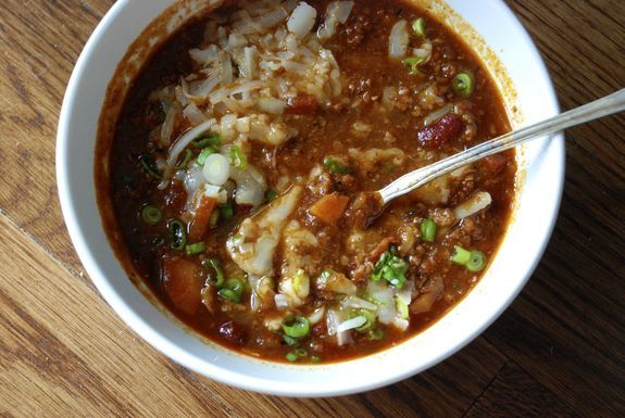
cristinasciarra demonstrates that when positioned the right way, even a messy bowl of chili can look great. Her Research Chili aftershot is focused, natural and presented just the way we’d like to eat it (spoon plunged and cheese melting). The wood-grain background gives interest to the negative space without distracting from the exciting things happening in the bowl (and the overhead angle practically begs us to dive in). The natural lighting here is key -- the chili wouldn’t look nearly as appetizing if it was shot in a fluorescent glow.
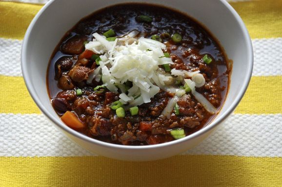
cristinasciarra’s before shot (below) makes a nice foil to the imperfections in her aftershot. Centered and slightly cropped, the details are sharp and perfectly composed. The bowl practically floats atop the striped background, the yellow providing a bright color complement to the chili.


See what other Food52 readers are saying.