You know how some people are obsessed with stamp collections or fantasy football teams? Well, we're obsessed with cookbooks. (Surprise!) Here, we'll talk them.
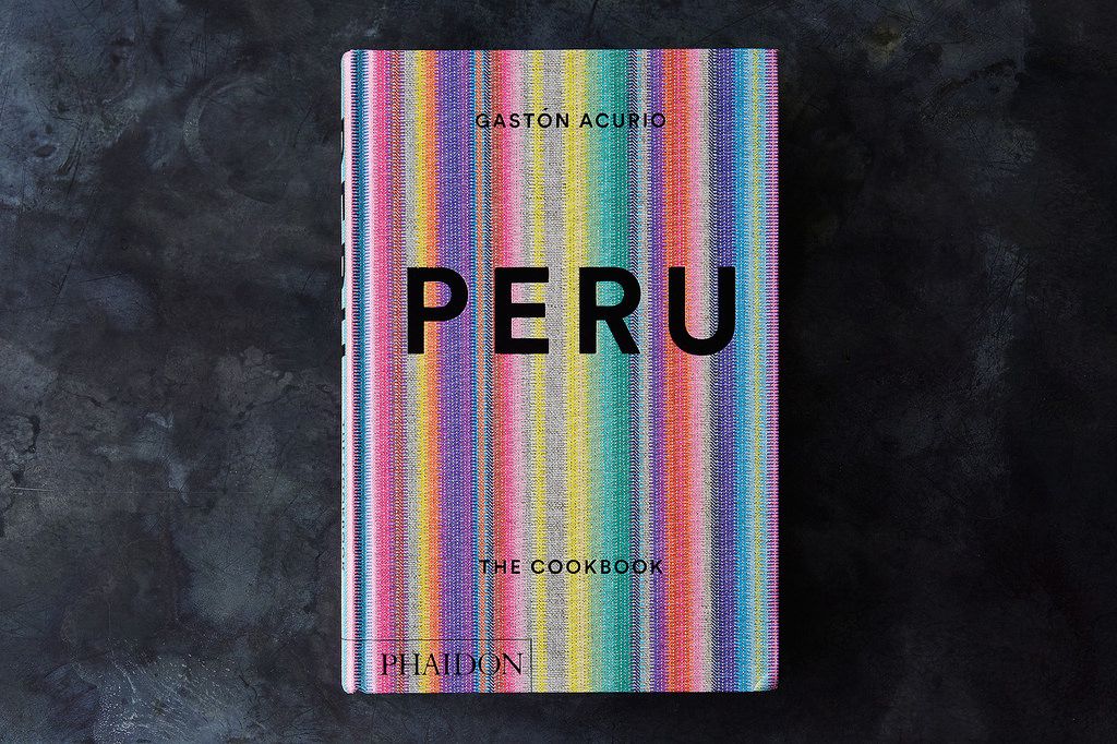
Today: When we look at books at a store or online, there’s just one cover—but how did that become *the* cover? Here, Julia Hasting, Phaidon’s Creative Director, tells us the story behind the cover of Peru by Gastón Acurio.

How did you land on this cover?
My goal was to design a cover with a broad appeal that instantly communicates contemporary Peruvian cuisine and culture without feeling cliché or pastiche and without looking overly folky.
More: Behind the evolution of the Fancy Desserts cover.
What were you inspired by? Are the patterns and colors significant to Peru?
I was inspired by the very unique colors and distinct patterns of traditional Peruvian woven fabrics.
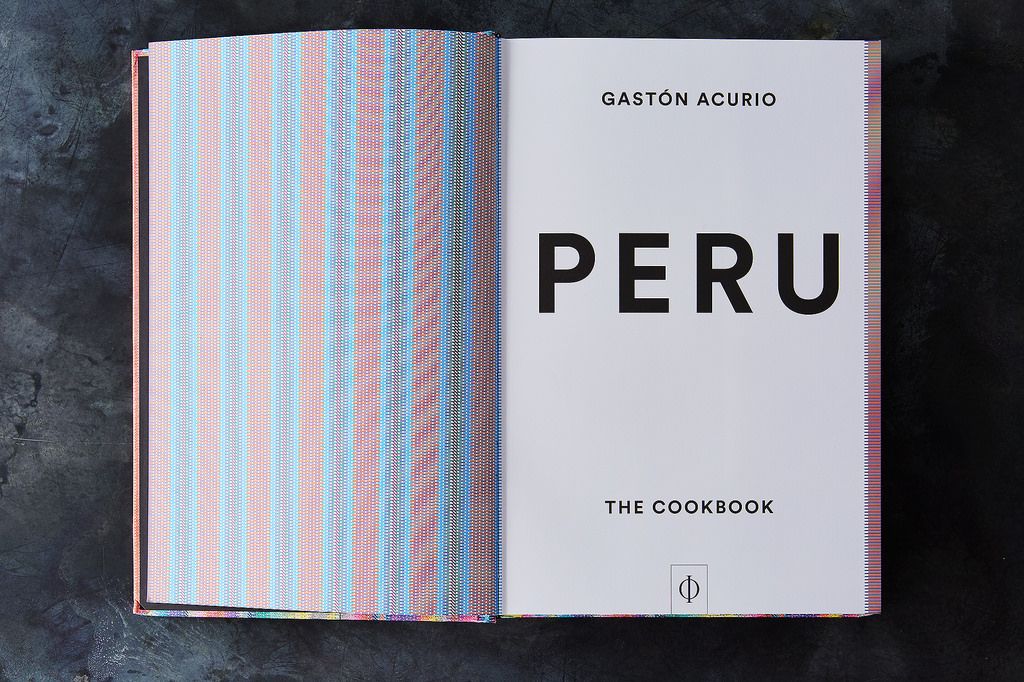
But rather than simply reproducing one of these folk fabrics, I designed my own pattern out of specific typographic lines, dashed lines, and rules, closely following color combinations of the traditional fabrics.

The dashed lines, which are the same dashes in the text of the book, are placed closely together and form a distinct abstract contemporary pattern that, in combination with the textured paper, form a unique identity for the book. These bespoke patterns are also found on each chapter opener. Furthermore, the same typographic dashed lines are on the outer edges of each page and form a nice pattern to complete the book.
What did the covers before this one look like?
This was the only iteration! The concept was successful and liked from the beginning.
Photos by James Ransom
See what other Food52 readers are saying.