Popular on Food52
30 Comments
Melissa B.
August 11, 2013
The new logo and all looks great! I think my favorite food color is that of raspberries - it's a beautiful red.
Sarah Q.
July 16, 2013
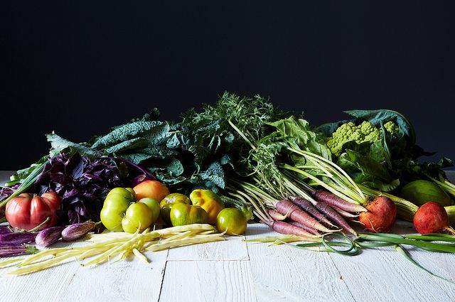
The golden zucchini and black raspberry sound fabulous together! I just pulled "rainbow" colored carrots from the garden yesterday and the array of pastel oranges and yellows are amazing.
Pegeen
July 13, 2013
p.s. Like using the "green" color palette in your logo, for all the positive connotations
Pegeen
July 13, 2013
Mazeltov on the design updates! In the spirit of helpfulness, have to agree with AmySarah and other commenters that given the smaller size of the logo in the nav bar, the green tint gets a bit lost and comes across as grey. (I love the Tuscan Kale green in the larger version in your editorial text but it's translating as grey on my display (in this case a 17-in Mac Book Pro, 1400x900). You might also have some trouble capturing the nuance of the green in printer's ink. I'd also have to agree the logo seems too diminutive in comparison to the ad sizes on the page. At first, I thought I was looking at a "secondary" page and clicked on the Food52 logo to see if it would go to a "main" page where the logo was more differentiated. In any case, nice work as always!
amysarah
July 12, 2013
Sort of a sage green...nice color, but where the logo is so small in the header, I don't think the color really 'reads' as much more than a cool grey. (Lovely shade where logo is large.) I think reducing the size of the navigation bar is fine, with one caveat: at least on my screen, the ad right below it occupies more real estate and is also more assertive than the site's identity - the elegant and subtle FOOD52 logo is proportionately tiny and sort of squished in the corner... just feels sort of hierarchically 'off' for the ad to feel dominant over site's identity.
Can I.
July 12, 2013
I agree that the new logo is disproportionately small for the site, especially when compared to the size of the ads.
Alanna K.
July 12, 2013
Also - the header is repeating itself multiple times on a page, very distracting and covering up both content and sidebar ads - maybe just on Bloglovin's [stupid] frames??? - Safari 5.1
Alanna K.
July 12, 2013
Looks very gray to me - like a cold and gloomy winter day. My own favorite color - rhubarb!
dymnyno
July 12, 2013
Not a vegetable, but I love the deep purple-black color of cabernet sauvignon grapes.
mrslarkin
July 12, 2013
love that color! global navigation bar is super tiny, so can't really pick it up on the small logo. Looks dark grey. Also, bottom of the logo is cut off on my view, fyi.
One of my fave color websites, totally addictive: http://blog.design-seeds.com/2013/07/12/beached-tones/
One of my fave color websites, totally addictive: http://blog.design-seeds.com/2013/07/12/beached-tones/
ChefJune
July 12, 2013
Peach is certainly a color, but is it a CRAYON color? French breakfast radish (such a happy shade of pinky-red).


See what other Food52 readers are saying.