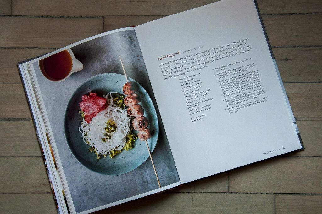
We’ve been told not to judge a book by its cover, but what about its photography, layout, typefaces, paper -- and how they all interact with each other? Each week, we’ll be sharing a book spread that’s worth taking a close look at for one reason or another. And we’ll ask you: What do you think about it?
Today: A striking spread that makes The Slanted Door cookbook stand out.

The Slanted Door by Charles Phan
Ten Speed Press (2014)
Photography by Ed Anderson
Design by Bullet Liongson
Prop styling by Ethel Brennan
Visit San Francisco, and you'll likely eat at the The Slanted Door. It's one of the city's most frequented restaurants, and for good reason: The Vietnamese food is luxe yet comforting, and the restaurant itself is designed impeccably. It comes as no surprise, then, that the cookbook is an object to be pored over -- not just for the recipes, but for the design as well. Here are five elements that make this particular spread in The Slanted Door simply stunning:
- Two-column recipe design means the pages are spare and airy
- Sans serif type that is confident and just thin enough that it's striking yet readable
- Slightly inset photography (you'll see a thin white border around the image) makes a big page feel more intimate
- The composition and colors of the image: The skewer placed just so, the dipping sauce leading to the main dish, the industrial metal surface, the casually furled pickled radish, and the overall contrast of a cool background and warm food
- The pottery in the image -- that blue bowl!
What about this spread makes it stand out to you?
Photo by Sarah Jampel
See what other Food52 readers are saying.