We may have food down cold, but wine? This is where we'll conquer it. Join us; we don't want to drink alone.
Today: Never be intimidated by a wine label again.
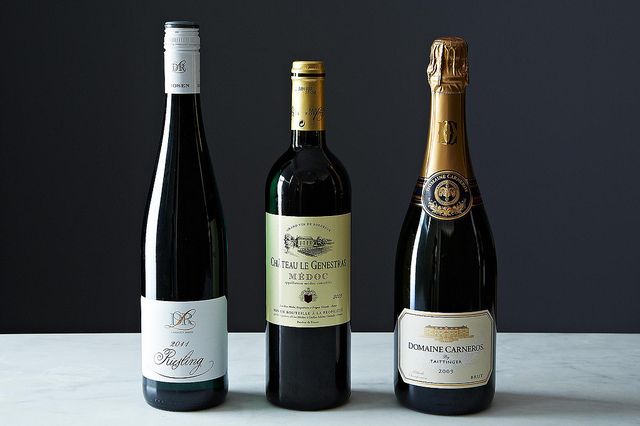
Think that the most valuable real estate in the wine world is in Napa Valley? Think again. It’s actually the front and back labels of a bottle of wine. They may measure a mere two inches wide by three inches tall, but they have a disproportionate impact on whether many consumers reach for one bottle and not another.
We aren’t suggesting that you judge a book by its cover, but the decisions a winery makes when it comes to its packaging are telling. Here’s how to turn those decisions in your favor.
The Big Picture
Some decisions, like the shape of the bottle, are dictated more by history and convention than a winery’s independent will. The shape of a bottle of Cabernet Sauvignon from Bordeaux or Napa, for example, has squared shoulders while a bottle of Pinot Noir from Burgundy has sloped or relaxed shoulders; side by side, the comparison has always struck me as almost football player versus those of someone in chess club. A bottle of Riesling, on the other hand, is tall and lean with a longer neck. The glass of sparkling wine bottles is noticeably thicker, bulked up to accommodate the pressure of the gas bubbles inside.
Message on a Bottle
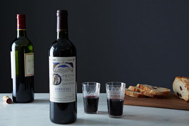
Imagine yourself standing in front of a wall of wine at your local store, and your eyes are passing from bottle to bottle. Do some strike you as playful and fun? And others as more severe and reserved? That contrast is a result of a multitude of graphical decisions: whether there’s a splash of color, as with the blue note from Domaine Faillenc in Corbières; whether there’s an image of a vineyard and châteaux, as is traditional with producers from Bordeaux such as Châteaux le Genestras; and whether the font is in a pretty script (see the Loosen Bros Riesling label) or in block letters, as with the Genestras.
Beyond the look of the label, of course, is what the label actually says. Compare traditional German wine labels at one end of the spectrum (Trockenbeerenauslese, anyone?) with the direct, just-the-facts-ma’am label from the New World, such as Nobilo from New Zealand. Nobilo’s front label tells you simply and cleanly what you need to know: name of the wine, where it’s from, what grape it is, and the vintage.
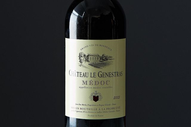
The choice of which information to include on a label is governed to various degrees depending on the country of origin. New World wines, from places like New Zealand and California, tend to be straightforward in their labeling laws, including data such as alcohol content. Old World wines, primarily from the European Union, come across to an American audience as more obscure because of their variations in language and quality categories which, to muddy the waters even more, are often conveyed using acronyms like DOCG in Italy and QbA in Germany.
Code Breakers
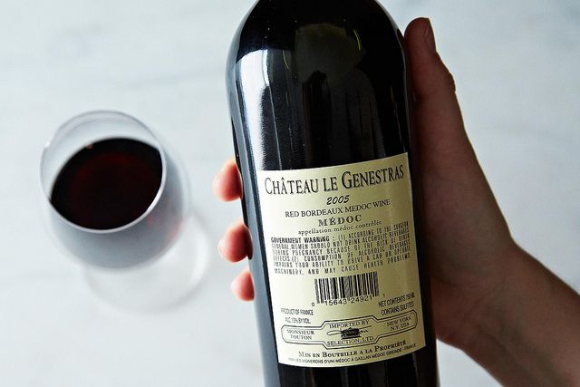
As consumers in the wine aisle, we have two very powerful tools at our fingertips. The first you often see when you turn the bottle around to its back label: the name of the importer. The next time you taste a wine you absolutely love, pay attention to who brought it into this country. Chances are good that you’ll also like more wines from that company’s portfolio, because their selections tend to follow the pattern of a particular style or approach.
The second powerful tool is what (or actually who) you see when you look up from the bottle in your hand -- that is, a knowledgeable staff person who works at the shop. After the label, consider her or him your personal code breaker to deciphering a bottle of wine.
Photos by James Ransom


See what other Food52 readers are saying.