Interior Design

The Ratio's Bryce Longton on What Makes a Great Photo

Sponsored
October 13, 2014

We're teaming up with Squarespace to get to know a few of our favorite bloggers a little bit better. Join us as they share their tips, tricks, and, of course recipes -- comment on the post for a chance to win a yearlong subscription to Squarespace (and scroll down for a code to get 10% off)!

Today: The Ratio's James Ransom and Bryce Longton share their tips for beautiful photos and no-fuss styling. 

The Ratio  The Ratio

Shop the Story

How do you take great photographs? We're lucky enough to turn to James Ransom, our resident photographer, and Bryce Longton, our Shop Editor & Stylist, when we're looking for inspiration. They've recently collaborated to launch The Ratio, a styling and photography site whose main goal is to teach blog and shop owners how to take better photographs of their products. Through in-person workshops and online classes, they're planning to teach people how to make a DIY studio, how to better understand lighting, and how to properly shoot and style products. 

We chatted with Bryce about her styling techniques, her pet peeves, and her favorite flea market finds -- check them out below.

How do you bring your design to life on your website? How can you use imagery and copy to make your website better?
Having a simple blogging system is key -- we use Squarespace. Having used many CMS systems before, this one is far and away my favorite. 

Imagery tells a big story about what you’re trying to showcase, teach, or sell. You can use photos to tell a visual story on your site -- start with images on a clean white background, using natural light (make sure you turn off all ambient light in the room), and create a compelling shot by trying different compositions and different angles. Take your time and take lots of photos (we sometimes take upwards of 50 shots to get one good one). Adding short, clear copy always helps, too. 

The Ratio  Lemons

What’s your biggest food styling pet peeve? 
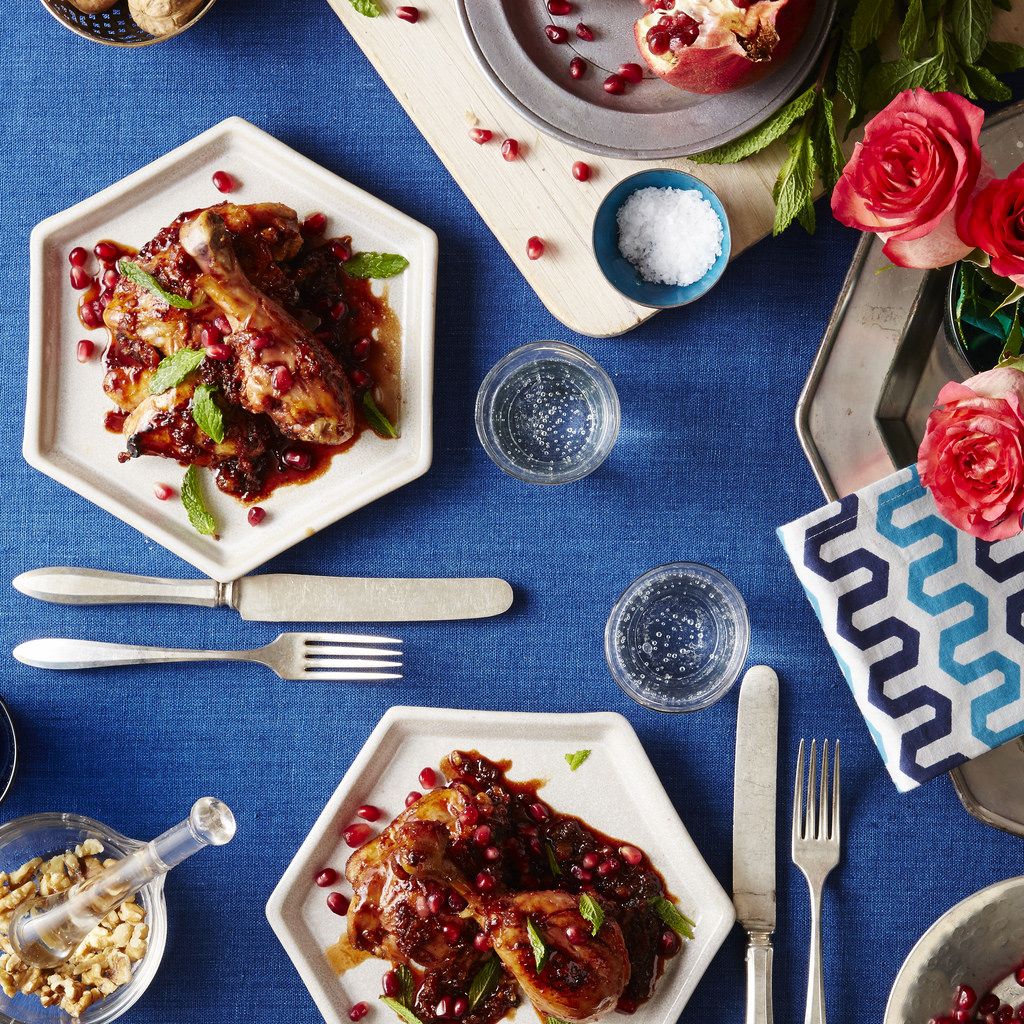
Random items in the shot that have nothing to do with what you’re photographing! Like if you have empty, cracked eggshells in the shot, but no egg yolks or batter. Another pet peeve is when the props take over the shot -- if your props (bowls, cups, napkins) are too colorful or too attention-grabby, it takes away from the the real star: the food.  

What can we always find in your kitchens?
Lemons. Salt. Sparkling water. Garlic. Chocolate (usually in the freezer). Almonds. Jam. Also an iron (you never know when a linen will need freshening up), and many, many small dessert-size plates and trays of vintage silverware. 

What props are your secret weapons? 
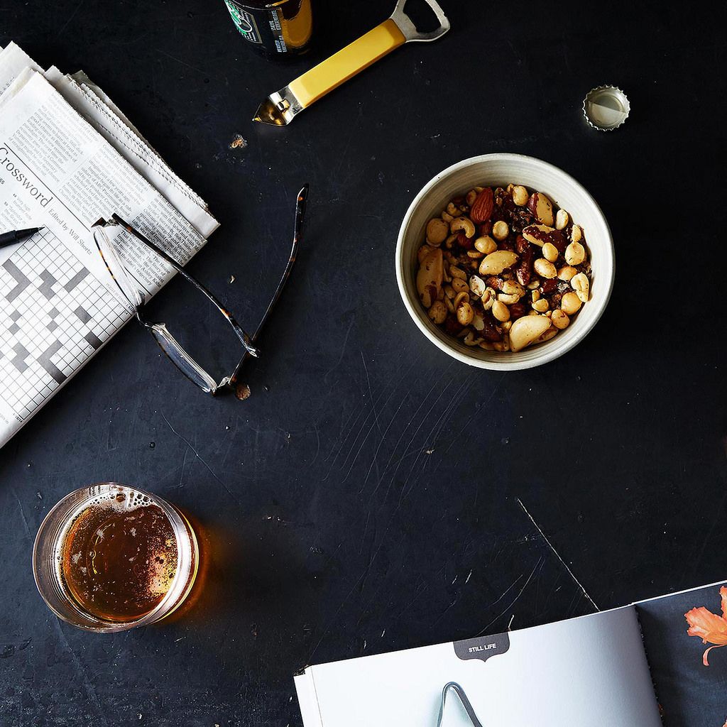
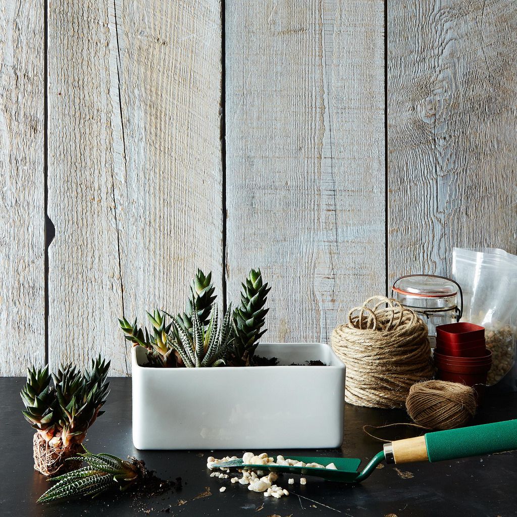
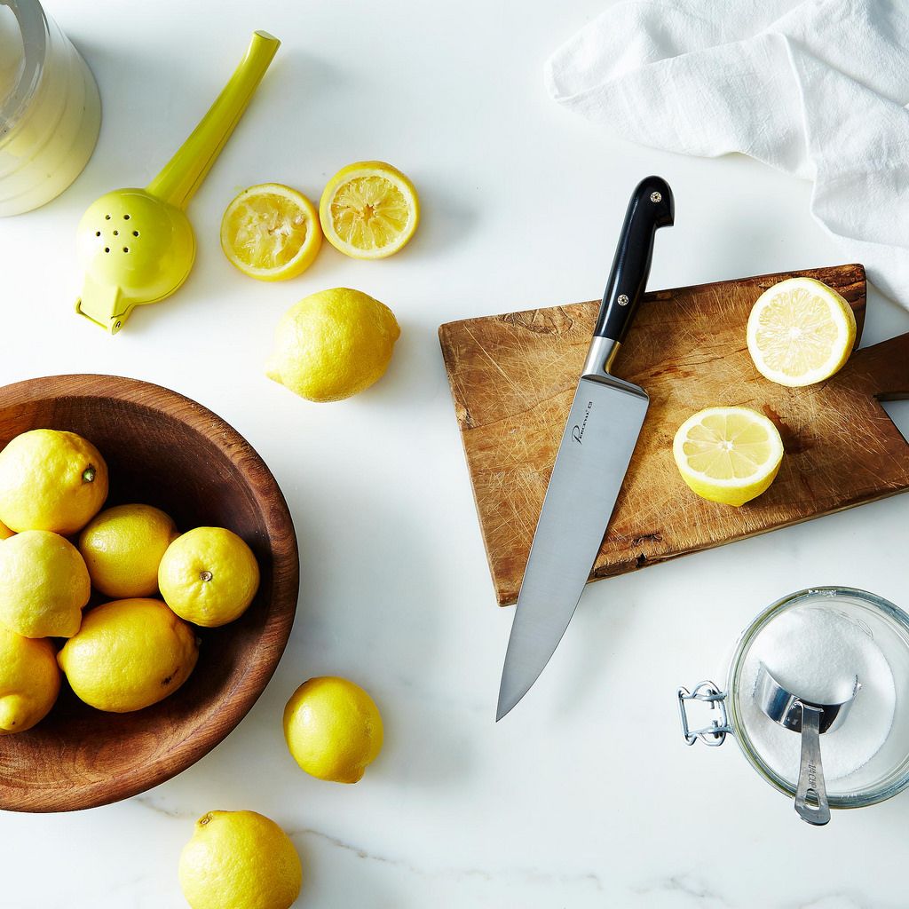
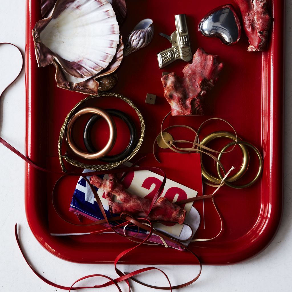
Succulents. Magazines. Bottle caps. Reamed lemons. Vintage Flatware. Fresh ingredients make amazing props, too, so make friends with your local farmers market vendors, and go early to get the best stuff. 

The Ratio  The Ratio

What’s the best “find” you’ve ever gotten at a flea market or vintage store? 
Scads of vintage flatware for pennies! Beautifully patinaed silver trays, and amazing old framed artwork -- it makes for great backgrounds for shoots. (Also, an amazing costume jewelry tennis bracelet.)

Any tips for shopping flea markets? 
Go early. Go often. Go out of the city (any big city, really). Choose “one thing” you’re looking for -- like old linens, or a cake server or a set of nesting mixing bowls -- and get hunting! At the same time, be open to finding serendipitous items (I found a pair of vintage Frye motorcycle boots for $20 in LA once, as well as a gorgeous old table top that I use for photographs now). 

What's one thing we can do to make all of our food pictures instantly better? 
Find out where the best natural light in your house is, and what time your “magic hour” is with that natural light, and set up your camera there; good light generally comes from a northern-facing window (which naturally diffuses light). The next thing you can do is use a tripod: It makes all of your photos steadier and easier to take. 

What's the biggest mistake that people make when lighting a photo?
They use a flash or ambient light (overhead light) instead of natural light. 

All photos by James Ransom

This article was brought to you by Squarespace! Use code FOOD52 to get 10% off, and leave a comment below for a chance to win a yearlong subscription --we'll pick a winner by Friday, October 24.

Listen Now

On Black & Highly Flavored, co-hosts Derek Kirk and Tamara Celeste shine a light on the need-to-know movers and shakers of our food & beverage industry.

Listen Now

See what other Food52 readers are saying.

  • Linda Taylor
    Linda Taylor
  • Julie O
    Julie O
  • AntoniaJames
    AntoniaJames
  • Nancy CBrush
    Nancy CBrush
  • Desiree Dearheart
    Desiree Dearheart
Sheela Prakash is a food and wine writer, recipe developer, and the author of Salad Seasons: Vegetable-Forward Dishes All Year and Mediterranean Every Day: Simple, Inspired Recipes for Feel-Good Food. Her writing and recipes can be found in numerous online and print publications, including Kitchn, Epicurious, Food52, Serious Eats, Tasting Table, The Splendid Table, Simply Recipes, Culture Cheese Magazine, Clean Plates, and Slow Food USA. She received her master's degree from the University of Gastronomic Sciences in Italy, holds Level 2 and Level 3 Awards in Wines from the Wine & Spirit Education Trust (WSET), graduated from New York University's Department of Nutrition and Food Studies, and is also a Registered Dietitian.

21 Comments

Linda T. October 15, 2014
Love SquareSpace, love food, love food photography, love you too!
 
Julie O. October 14, 2014
Great stuff. I live in the woods and have very little good light in the house. Frustrating. Sometimes I'll just take something out on the brick front steps.
 
AntoniaJames October 14, 2014
Is that a marble surface on which those cut lemons and a just-used juicer are sitting? Doesn't that acid etch the marble? Or is there some workaround to prevent that? ;o)
 
Bryce L. October 16, 2014
Hi Antonia! The trick is to clean up immediately. We try not to let any acidic juice or fruits lay about on the marble for too long (and sometimes we do, and it etches the marble, but we chalk it up to "character" then).
 
Nancy C. October 14, 2014
Brilliant suggestions from a talented photographer. I especially like the suggestion to use a northern facing window for best results. Sometimes I have to go to each side of the house to try and find the best exposure.
 
Desiree D. October 14, 2014
Ah, exactly what I have been waiting for! I've been practicing my styling and photography, trying to capture the personalities of my dishes! The serene soups, the raucous appetizers, the sensual desserts... James and Bryce produce stunning images, I can't wait to start practicing their tips!
 
Julie W. October 14, 2014
I love the photography (and writing ) on food52 so I have been waiting for this article . I always take #mygreenjuice pictures on Instagram outside because I love natural light . So thanks for the north light tip and making this article so beginner friendly . If I win Squarespace here I come . No more excuses.
 
Marion C. October 14, 2014
Squarespace is just rgeat, i use it for 2 website I own and I can't stop telling good stuff about them :) !
 
Elisabeth C. October 14, 2014
I love Squarespace so much and food52 is awesome. I am a full time food photographer and love the inspiration and recipes.
 
Mary B. October 13, 2014
I love the tips! My biggest problem is that I cook later in the day and my pictures are not snapped at optimum light times......
 
Laura W. October 13, 2014
Ah, these photos are inspirational! I find myself poring over them to uncover all of the different elements. Thank you for the tips.
 
Pegeen October 13, 2014
Thank you for the great advice. Especially appreciate your teaching guidance about natural light.
 
kpeck October 13, 2014
great article! and i would love to win...Squarespace is the BEST! :)
 
Renata H. October 13, 2014
I am looking into Squarespace right now! A free one-year subscription would be nice. :)
 
carolyn October 13, 2014
FINALLY made switch the from Blogger to Squarespace this month. Big fan - esp of their amazing customer service.
 
TiphanyP October 13, 2014
Awesome advice. I have been wanting to use Squarespace forever now!
 
Meilina October 13, 2014
Great advice! I really love the photos on Food52...
 
Tahica F. October 13, 2014
I love Squarespace! I use Squarespace for both my digital magazine and photography site.
http://commongroundart.squarespace.com
http://tsfphotography.squarespace.com
 
Sarah October 13, 2014
Thanks for all of this awesome advice! I'm just dabbling in food photography in my kitchen, so it's been fun to try different things all of the time.
 
Sini |. October 13, 2014
I've been using Squarespace for over a year now and love it! Great design and easy to use.
Props can really make the different between a good and an awesome shot. It doesn't even have to be much; already an interesting background or an artisan plate can make a dish shine.
 
Antonija October 13, 2014
Thank you for the advice.
Also a huge fan of Squarespace :)