We’ve been told not to judge a book by its cover, but what about its photography, layout, typefaces, paper—and how they all interact with each other? Each week, we’ll be sharing a book spread that’s worth taking a close look at for one reason or another. And we’ll ask you: What do you think about it?
Today: The meat of Franklin Barbecue's design and photography.

Franklin Barbecue by Aaron Franklin and Jordan Mackay
Ten Speed Press (2015)
Photography by Wyatt McSpadden
Design by Betsy Stromberg
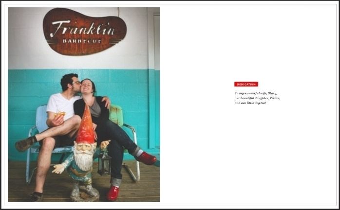
We've been choosing one spread to talk and think about the design of a book, and this week we indeed chose a very spare, preliminary page from Franklin Barbecue—pages iv and v, the dedication page. Here's what this spread tells us about the book, before even getting to the heart of it:
- It'll be bold: The red around the dedication headline is not shy in color or heft. The contrasting all-capped text isn't bashful either.
- It'll have personality—the italicized type is playful. And that photo. Did you "awww"?
- It'll feel personal and slightly homespun: The page is bordered with a light gray line, and the photo is inset within that square. The result looks like a contemporary scrapbook, where the photo is more of a keepsake than it is a full-blown beauty shot, as photos often are in other books.
-
Franklin Barbecue will be fun. Through the type, color scheme, photography, and layout of these elements, you get a little Texas, a bite of barbecue, and a big hint about how Franklin will go about telling us about these topics.
What about this spread makes you want to keep reading (and cooking)? What other book designs have sucked you in lately?


See what other Food52 readers are saying.