We’ve been told not to judge a book by its cover, but what about its photography, layout, typefaces, paper—and how they all interact with each other? Each week, we’ll be sharing a book spread that’s worth taking a close look at for one reason or another. And we’ll ask you: What do you think about it?
Today: Alex Atala is regarded as one of the world's best chefs, yet through the design of his book, it's clear he wants our focus to be on his food.
D.O.M.: Rediscovering Brazilian Ingredients by Alex Atala
Phaidon (2013)
Design by R2 Design
Photography by Sergio Coimbra and Edu Simões
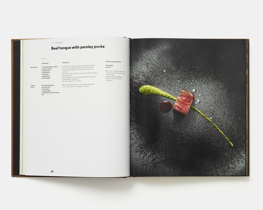
The year D.O.M. was published, its author, Alex Atala, was the only chef to be included on Time magazine's list of the 100 most influential people in the world. Alex Atala is big time—he's allowed to show off a bit—so he could've himself been the focus of the book. There could've been some pictures of him in his São Paulo restaurant kitchen, eating with buddies David Chang or René Redzepi, or wandering through the Brazilian rainforests foraging his own ingredients. While the book does have gorgeous environmental photography, it is not about Atala—it's about the food he has created. Even if many of the recipes are too high-end for us to ever make, we're given clues that this is the intention through several of the book's design elements. For example, take the spread above for the recipe for beef tongue with parsley purée:
- Color is only coming from the image, specifically the food. The circles on the black surface direct your attention to the food, too. There isn't a linen or wine glass or other doodad to set a scene: It's all about that beef tongue and vibrant purée.
- Moreover, the page of text is rather colorless. Sometimes, recipe elements are isolated with various colors, but, in this case, you might only look at the recipe after you became entranced with the food in the photo.
- There isn't a headnote to bother with—no story to whisk you away anywhere else, no opportunity for Atala to wax poetic about the food. It speaks for itself.
- The recipe itself messages the same thing: It's short—brief by any cookbook's standards, but shockingly short for a restaurant dish. There's really nothing extraneous (no complicated techniques, variations, or sidebars) that could distract you.
- The grid in which the recipe is set and the bullets that introduce the elements and steps make the recipe feel quite scientific. There's no messing around here. It's all about the food.
Does this approach—letting the food speak for itself—make you want to make a recipe more? What parts of this design stand out to you?
Image courtesy of Phaidon
Written by: Ali Slagle
Popular on Food52
3 Comments
No photos of the author and his friends, pets, favorite beach, etc.: Yes, thank you.
Efficiently drafted recipe that's to the point, with nothing extraneous: Yes, thank you.
Clean, uniform font size and color: Yes, thank you.
No headnotes: Yes, thank you.
I'd say he's ticked all the boxes for me. ;o)
See what other Food52 readers are saying.